
One Room Challenge – Week 2- Choosing a Color Palette
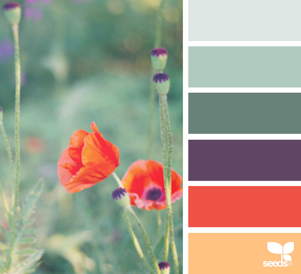
image via: @tangledgarden
Here we are, in the second week of the One Room Challenge. Very fun!
If you read about my plans for the living room last week, then you know I want to paint a mural on the wall. If you didn’t, you can read all about it here.
Choosing the right color hue for the mural is M-A-J-O-R. Probably the most important decision. I want it to be happy and calming. Bright and muted, is that even possible?
I want fun colors like purple, orange, and green, but in a calming version. For example, lavender would be a nice shade of purple, don’t you think?
When I am in a color dilemma, I like to visit design-seeds.com. This is a website run by Jessica Colaluca, and it is full of color inspiration. She finds beautiful images and matches them to its corresponding color palette; she chooses approximately 6 colors that are the main shades of the photo.
I like to look for color palettes inspired by nature. They are a sure way to find elegant and beautiful tones, without craziness, but great taste.
I was roaming through this website and found a lot of ideas. Here are the hues I liked the most (including the one on top of this page):
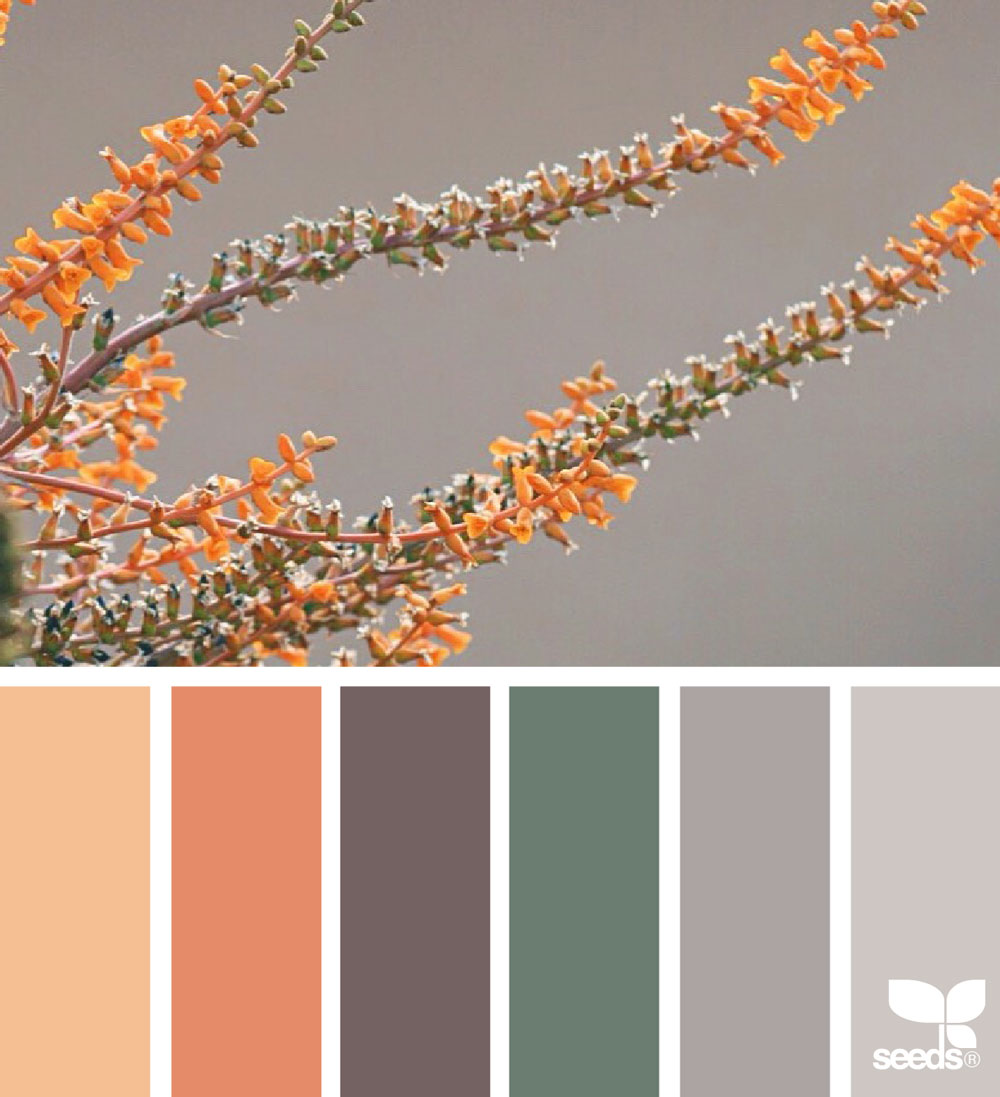 image via: @carolyn.eve
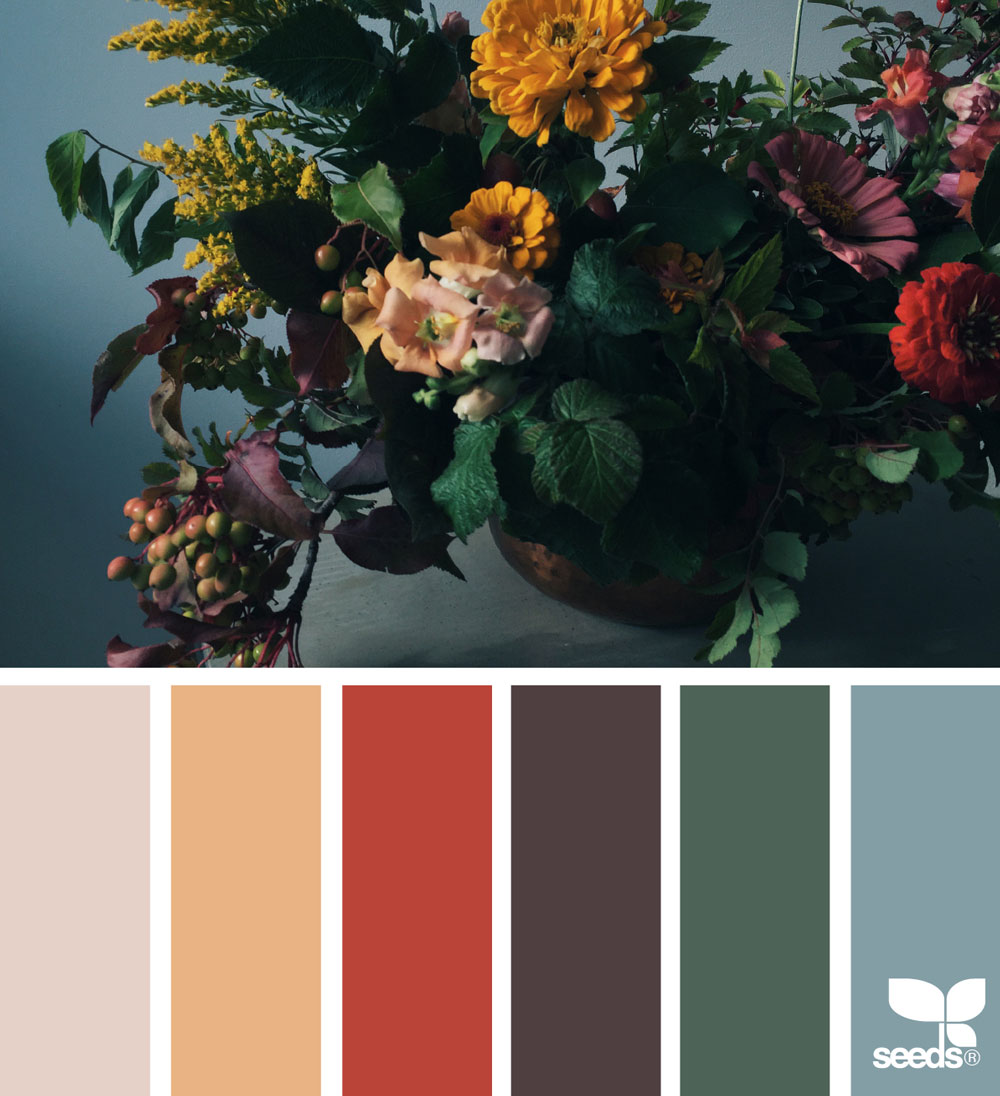 image via: @theflowercult
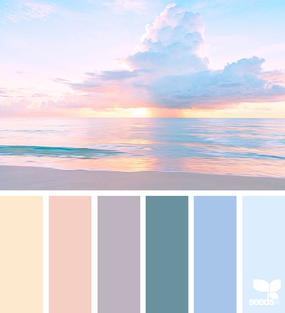 image via: @ozgecenberci
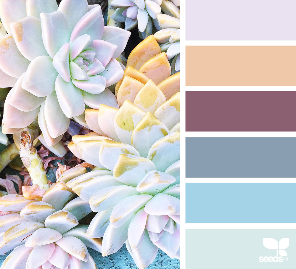
image via: @traceybolton
What do you think? Which palette should I choose for the mural?
I am leaning towards the flower cult photo. It has orange, purple, green, and grey. The colors are a perfect combination that is not overpowering or too vibrant.
What do you think?
My plan is to choose colors this week, find vintage decorations next week, come up with a final design, and start painting in two- three weeks. Wish me luck!
For more on this challenge, here is Week 1.
Thanks for stopping by!


I think the first and the third are my favourite, though the last is gorgeous, too. I’m more of a non-pastel person when it comes to interior design, though, so that’s probably the only reason I didn’t choose the others (as they’re very pretty too!). I think you need to choose something with orange at this point, it’s popped up in almost every one of these and so I feel like it’s almost calling out to you, haha! But whatever you do, I’m sure it’ll be amazing, especially considering your last room makeover!
True! Orange pop ups have to be there. A little bit of purple too… I am excited about this!