
ORC Kitchen Plans – Week 1 – Color Blocking
Reading about how artists get inspired is one of my favorite things. I love hearing about the process behind the idea and creation. It pisses me off when design magazines skip this subject altogether. How do designers come up with a plan? Why did they decide to use this material versus another? The written content of so many design magazines is SO LAME, don’t you think? I never read the articles because there is nothing substantial in them. It is a bunch of superficial facts put together that lacks the project background story that I am interested in… or do you read the whole design magazine? I wonder.
Why do I mention this? Because the process that ignites a room is interesting to me. Those first ORC posts that talk about inspiration are one of my favorite ones but some that not a lot of people pay much attention to.
(As a reminder of the other One Room Challenge that I have participated in before, here is a link to the reveal of my kids’ room and here is the reveal of my living room that has a big colorful mural, in case you want to take a look.)
This Spring, I am redoing our kitchen. I shouldn’t say “redoing,” as this space has never really been done. It looks the same as it looked six years ago when we moved in. At the time, we bought some IKEA cabinets, countertops and fixtures and that was it… until now.
What was my inspiration and story behind this kitchen design concept?
Let’s start with a photo:
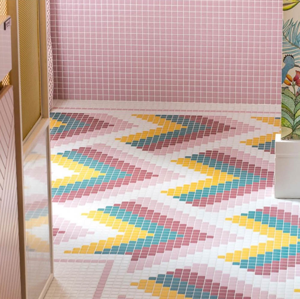
(Image via Nuria Alia)
The first time I saw this floor, I felt inspired. The colors and tiles spoke to me (is that possible?). This image lived with me for a long time, and when I decided to do the kitchen, I knew I wanted to use similar colors.
This is how I decided to paint the bottom cabinets of the kitchen a color close to radicchio. What is funny is that Farrow & Ball has a color with that same name in their catalog. Of course, I am not the kind of person that has the budget (or desire) to spend $90 in a can of paint, so I will probably ask my local paint store to match the color with another paint brand.
If you know my home, you know that is full of vibrant colors. (Here is a Spring Tour of my place with photos in case you want to take a look.) This time I want to use a different color palette and do something a little bit more sophisticated. Less obvious. Do you know what I mean?
I used the Pantone app to help me narrow down the color palette. Have you used it? It is a lovely way to get color inspiration. It is not always easy to mix and match different colors and, now that I have been doing this amateur design thing for a long time, I understand the importance of the various tones! One tiny drop more of red in a mix of pink would change the color! It makes a difference, and it is essential to get the perfect shade.
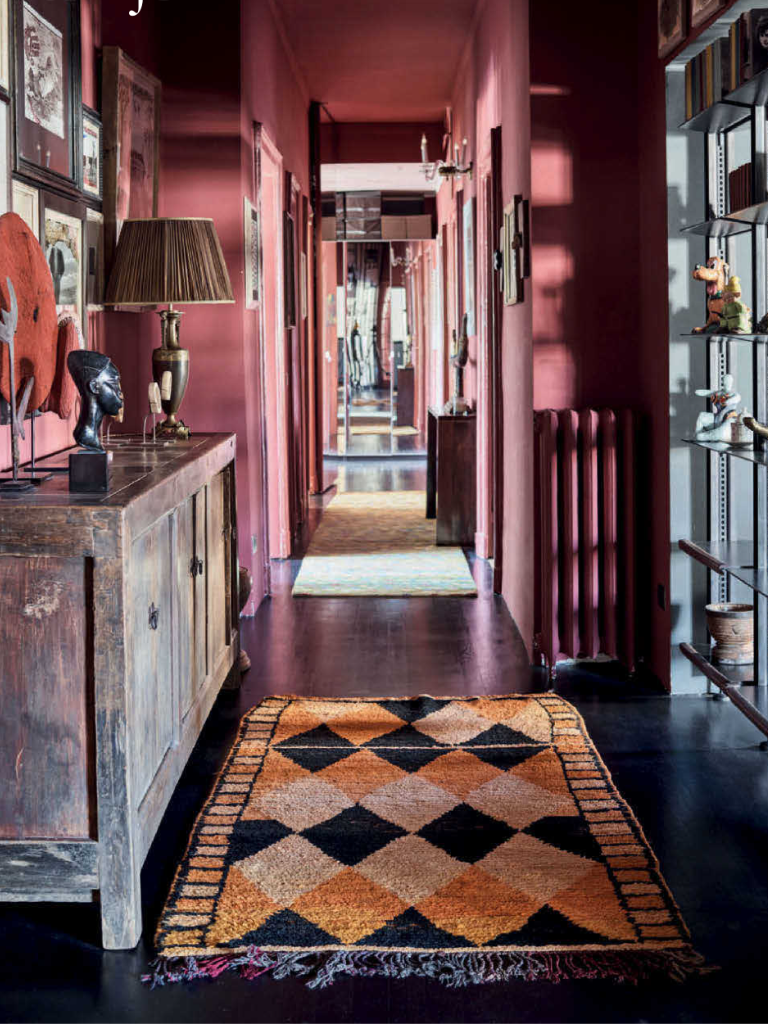
Here is that radicchio color I want to use for cabinets used in a hallway and an inspirational “radicchio” photo.
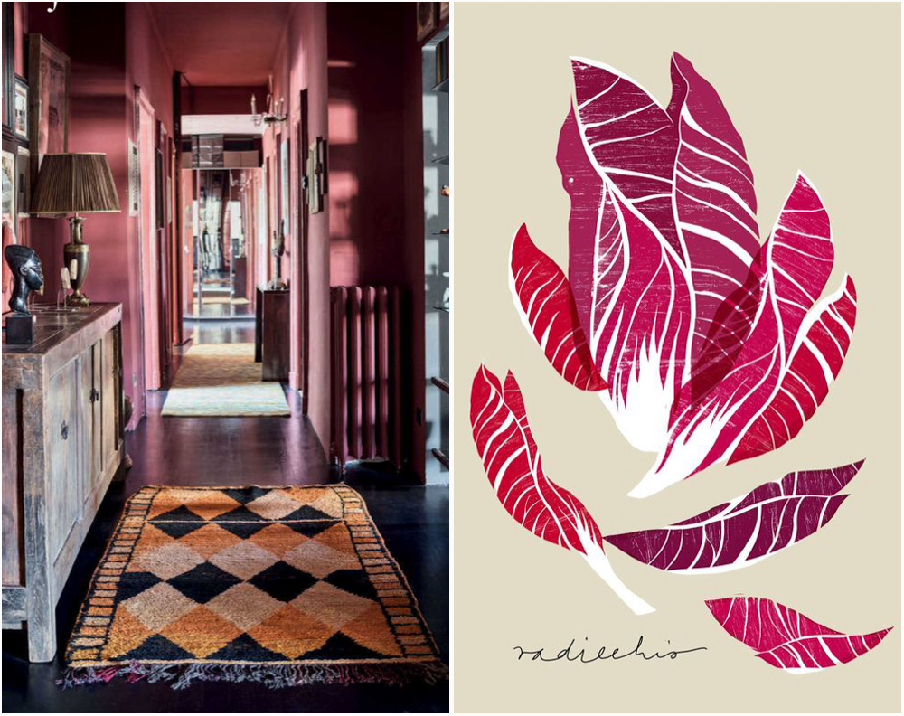
( Image 1 – Image via Ana Zaja Petrak)
In this hallway, the color looks lighter than it is in my kitchen. The idea is to paint the bottom drawers radicchio but leave the top ones white. Although, I might change my mind about that later.
Another idea I have been pondering with is color blocking… not in the real sense of the word but in the sense of adding blocks of color to the space that work as art and eye magnets.
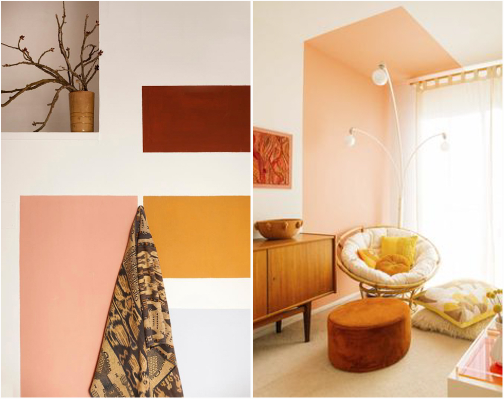
(Image via Casa Josephine – Image via Dabito)
I adore the two images above. Paint can be used in simple ways to create impact for NO money! Am I right or am I right? I am doing something like this in my kitchen.
The thing is that I don’t have a big budget. I would love to add more texture to my kitchen and fancy fixtures, but I can’t afford it, so I need to be creative about how to make this space special so I am relying on paint.
Regarding tile, I want to use subway tile because of affordable price and simplicity, but I am worried about how overused it is. I mean… EVERYBODY uses subway tile!!!! So I was very happy when I found this handmade subway tile at Lowe’s that it is long and has texture. It looks something like this:
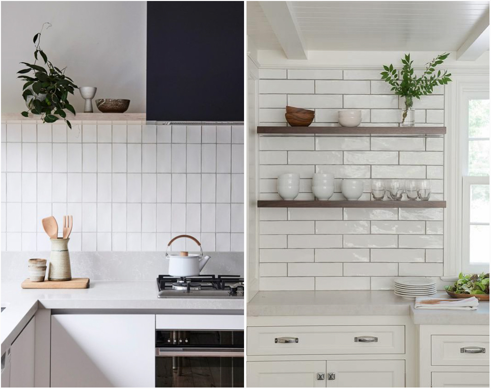
(Image via Pinterest – Image via Decorpad)
I am unsure about how to line up the tiles. I like the vertical look, but I think the horizontal is nicer… although I don’t want the pattern to be the typical one where each new row lines up halfway through the tiles of the bottom row as you can see in the photo above on the right.
Another thing I wanted to do was adding molding to the kitchen, maybe panels too? Well, that was the plan until I saw this photo from Kelly Wearstler’s Instagram:
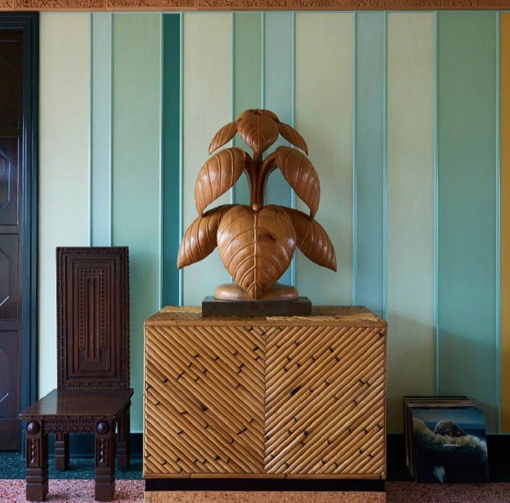
(Image via Kelly Wearstler)
How original is that? The painting has a little bit of texture that I am not sure I will try to replicate, but I will do color blocks on the dining room wall. Another easy and cheap trick that can make my kitchen look special.
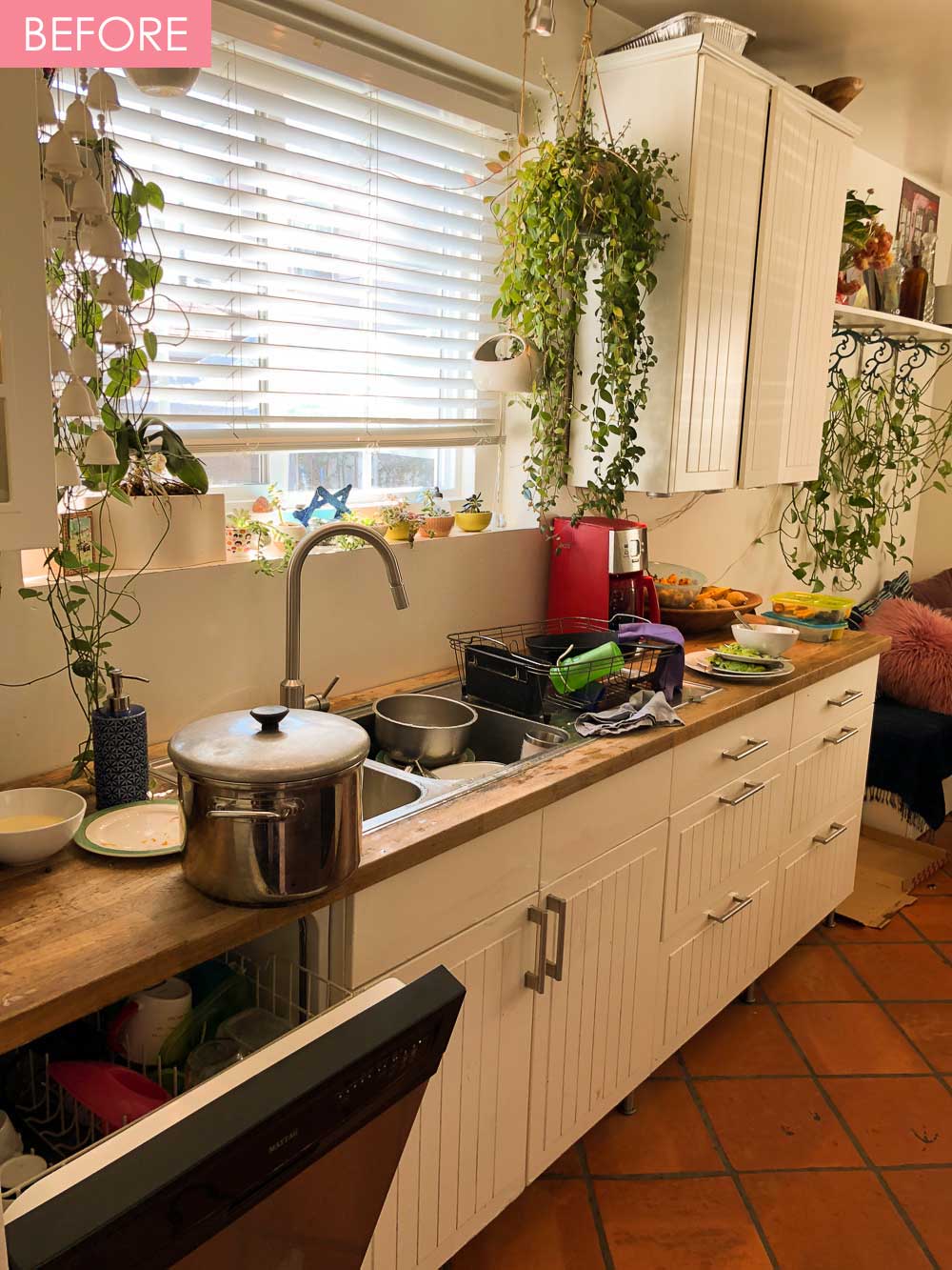
Now that I have shared my inspirational photos, let me take you through my current kitchen photos for a little taste of before pictures, before you move on, sorry for the mess and dirty dishes:
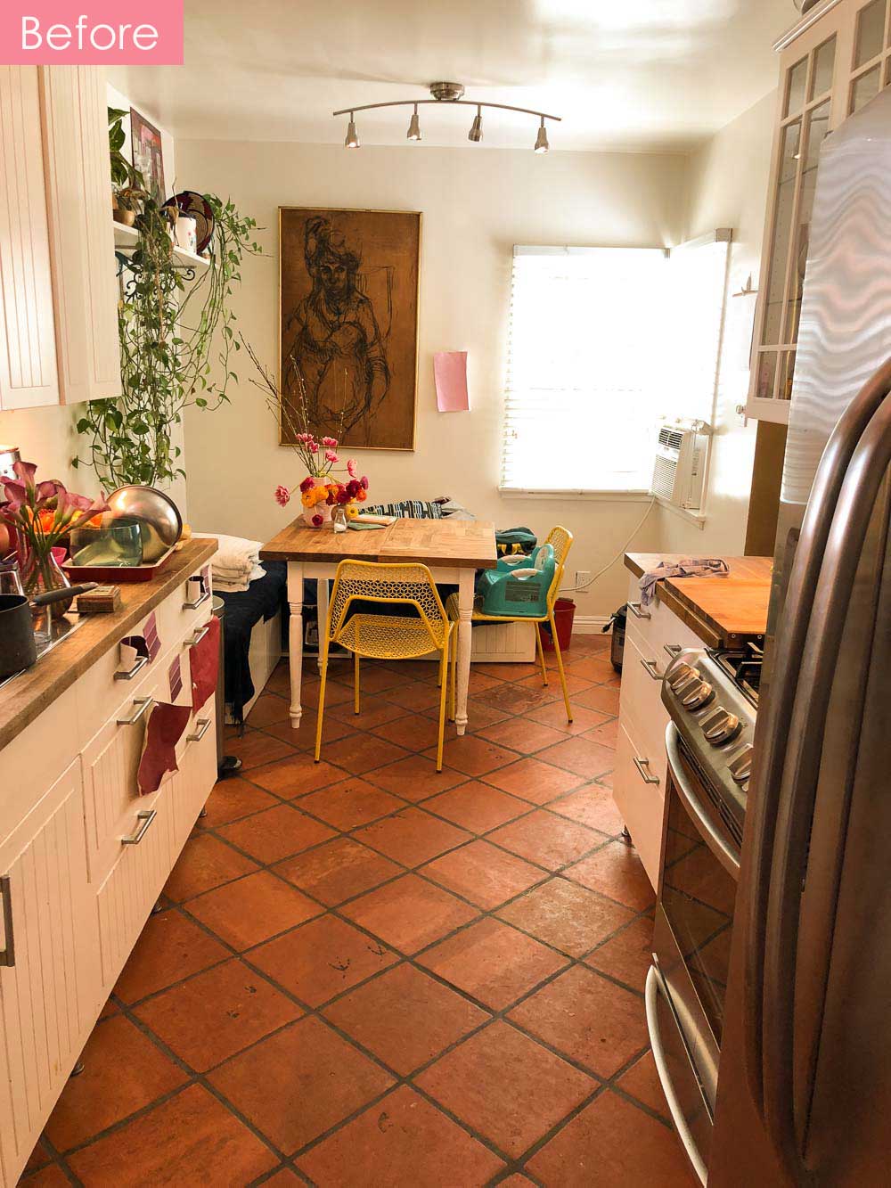
I do like the dining room right now, and I have some photos on IG that look a lot better than the image above, but I also need something new, and I am excited to see some changes in this space. 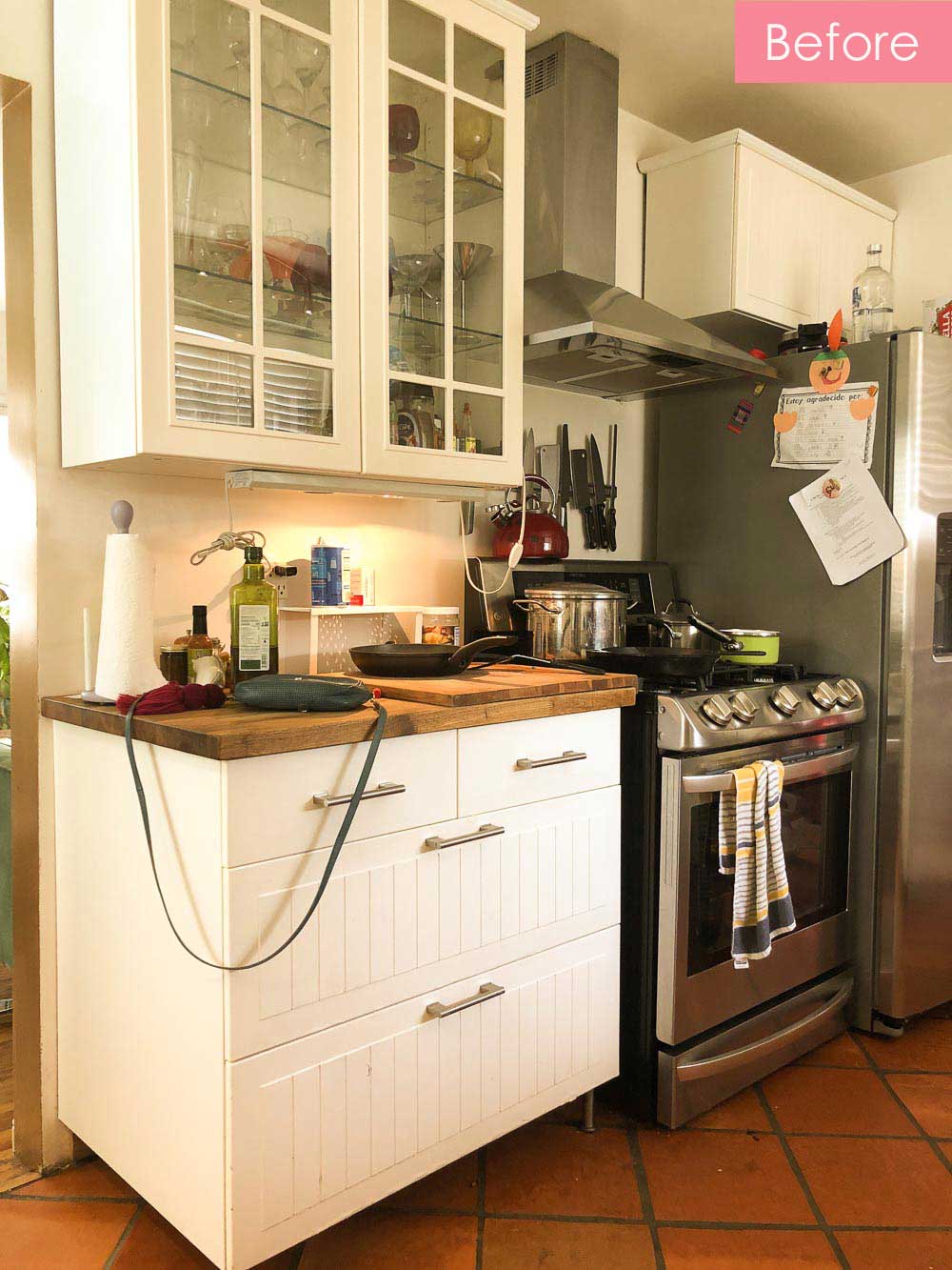
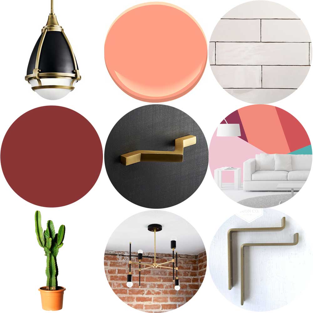
Here is my mood board: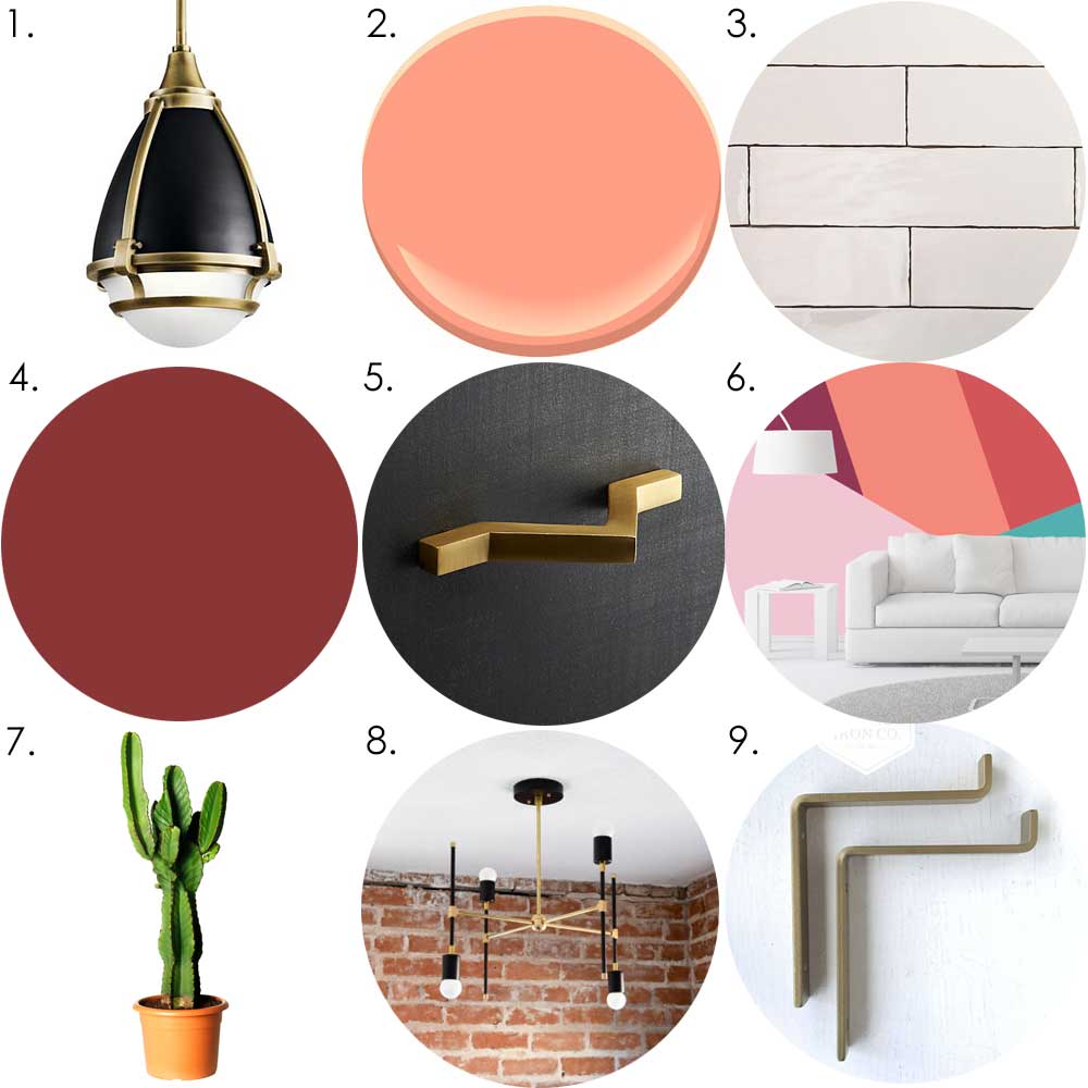
1. Pendant light | 2. Dusk Pink Benjamin Moore | 3. Handmade subway tiles
4. Radicchio – Farrow & Ball | 5. Brass Handle | 5. Brass Handle
7. Euphoria cactus | 8. Brass and black chandelier | 8. Brass and black chandelier
If you want to follow the challenge:
Week 2 | Week 3 | Week 4 | Week 5 | Week 6
OK. I hope you follow along during this Challenge. The next five weeks will be busy and intense. Did I mention I am 7 months pregnant? AUGH! See you next week.


Love this post and that you are sharing your process! Can’t wait to see the final outcome.
You can come home anytime to see!!! muak
OH MY MILA! THIS IS AWESOME! Those colors rock!
I am hoping the final package looks cohesive and fun!
Your lighting choices are fantastic! I had my eye on that particular pendant. Can’t wait to see how you execute this super fun color scheme! You’re so brave to do this so pregnant btw… 🙂
My husband agreed to help me or this would not be possible!
I totally agree with you! I, too, really enjoy and learn from hearing the designer’s whole process. Love watching and reading about your design process.
Thanks! What is funny is that already so many things have changed! you will see.