Zaha Hadid’s Home

jestcafe

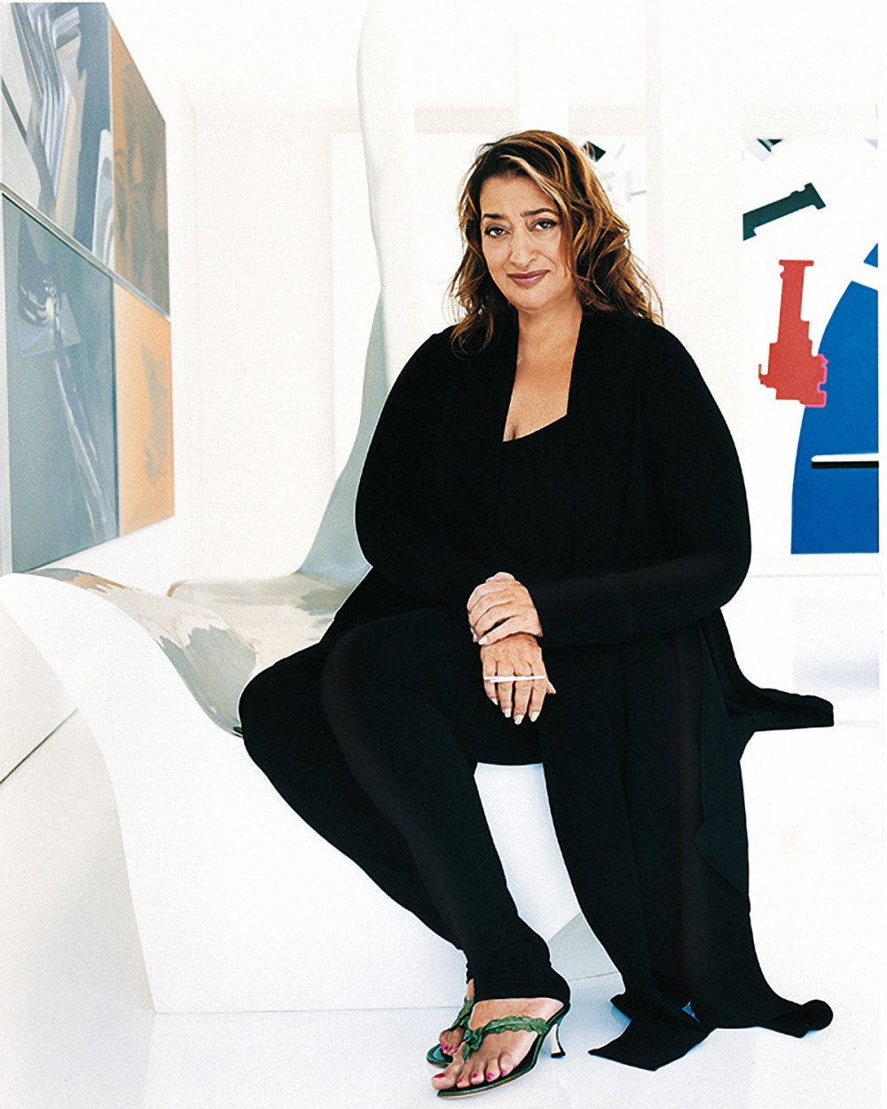
As most of you know, Zaha Hadid died last week. For those of you who don’t know who she was, here is her wiki bio:

Zahā Ḥadīd; 31 October 1950 – 31 March 2016) was an Iraqi-born British architect. She was the first woman and the first Muslim to receive the Pritzker Architecture Prize, winning it in 2004. She received the Stirling Prize in 2010 and 2011. In 2012, she was created a Dame Commander of the Order of the British Empire and in 2015 she became the first woman to be awarded the RIBA Gold Medal in her own right. 

I have been following Hadid’s work at a distance for a while. I love her drastic vision filled with strong forms and lines, and I have also been drawn to her prolific work on interior design. She designed furniture, vases, art, and other product lines.

How can somebody be so creative as to put a stamp on so many different industries and products? Pretty amazing woman, I must say. After her death, I can’t help but wonder about all the work she could have done, had she been given another 20 years of life.

I also started asking myself other questions like: where does a woman like this live? What is her decoration style? How does her home look like? Well, I found the answer, and it didn’t disappoint.

Here are some photos of her home in London taken by AD Spain in 2008. White walls (ceiling to floor), original furniture (a lot of her own designs), pops of color, and just a clean and strong aesthetic that matches her architectural designs.

When you look at these photos, enjoy the details! Every item is there for a reason. This woman was such a perfectionist, and her home is a reflection of that.

jestafe.com-zaha hadid 10
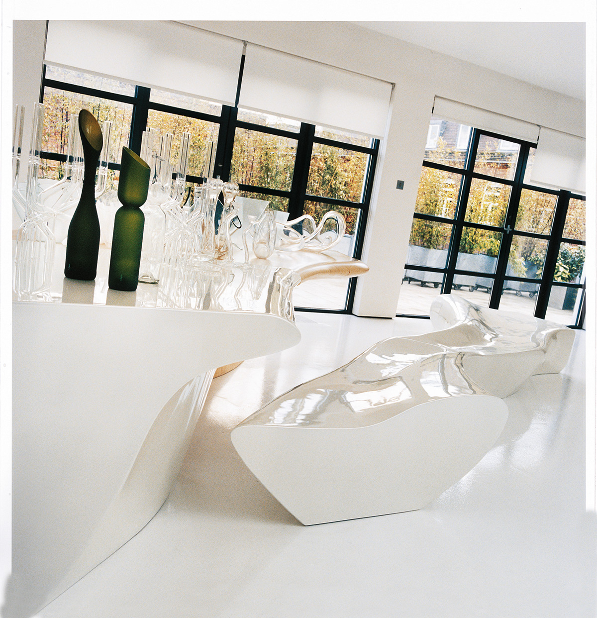
Light!! So much light…The furniture and vases were designed by Hadid. jestcafe.com - Zaha Hadid6
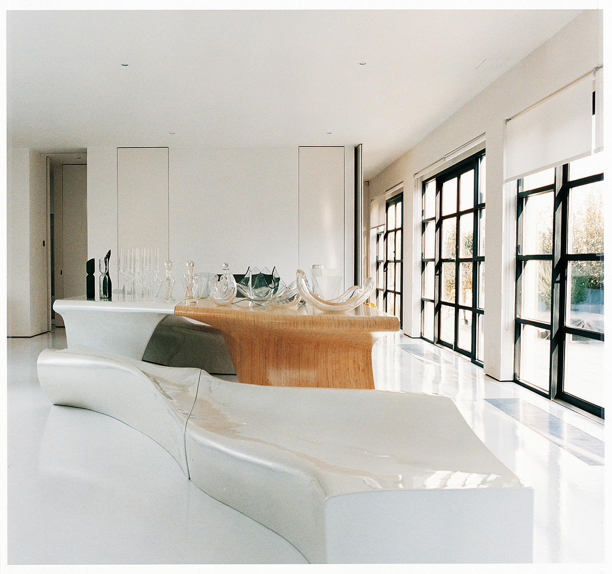
Look at that table! Isn’t it gorgeous. And that “sofa” is supposed to reflect the movement of glaciers… and it does, don’t you think?jestcafe.com - Zaha Hadid8 
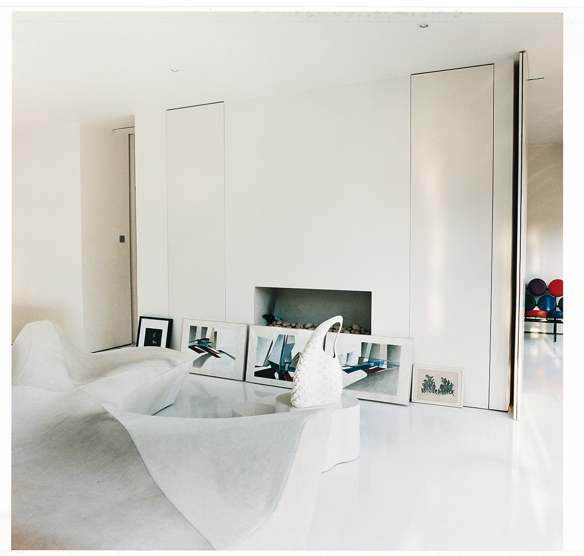
She designed that Louis Vuitton bag… for real. I wonder what this woman didn’t do. She lived 5 lives instead of 1. jestcafe.com - Zaha Hadid7
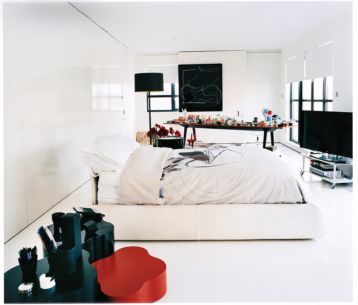
Her bedroom… so clean, almost clinical, and I am sure that TV was rarely used. jestcafe.com - Zaha Hadid4
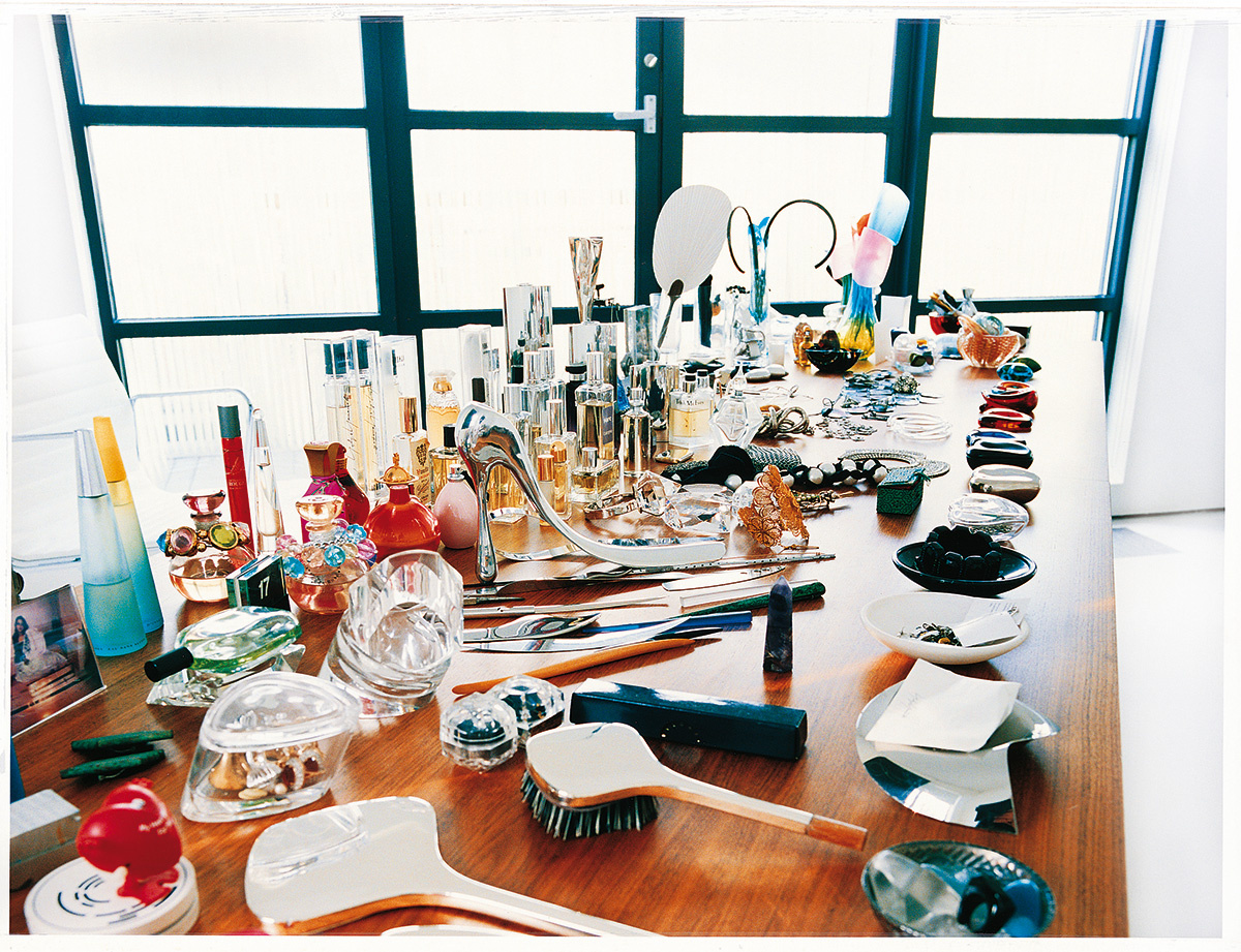
Her vanity table, perfectly arranged. It looks like a museum piece instead of a place where you apply make-up.
jestcafe.com - Zaha Hadid5 
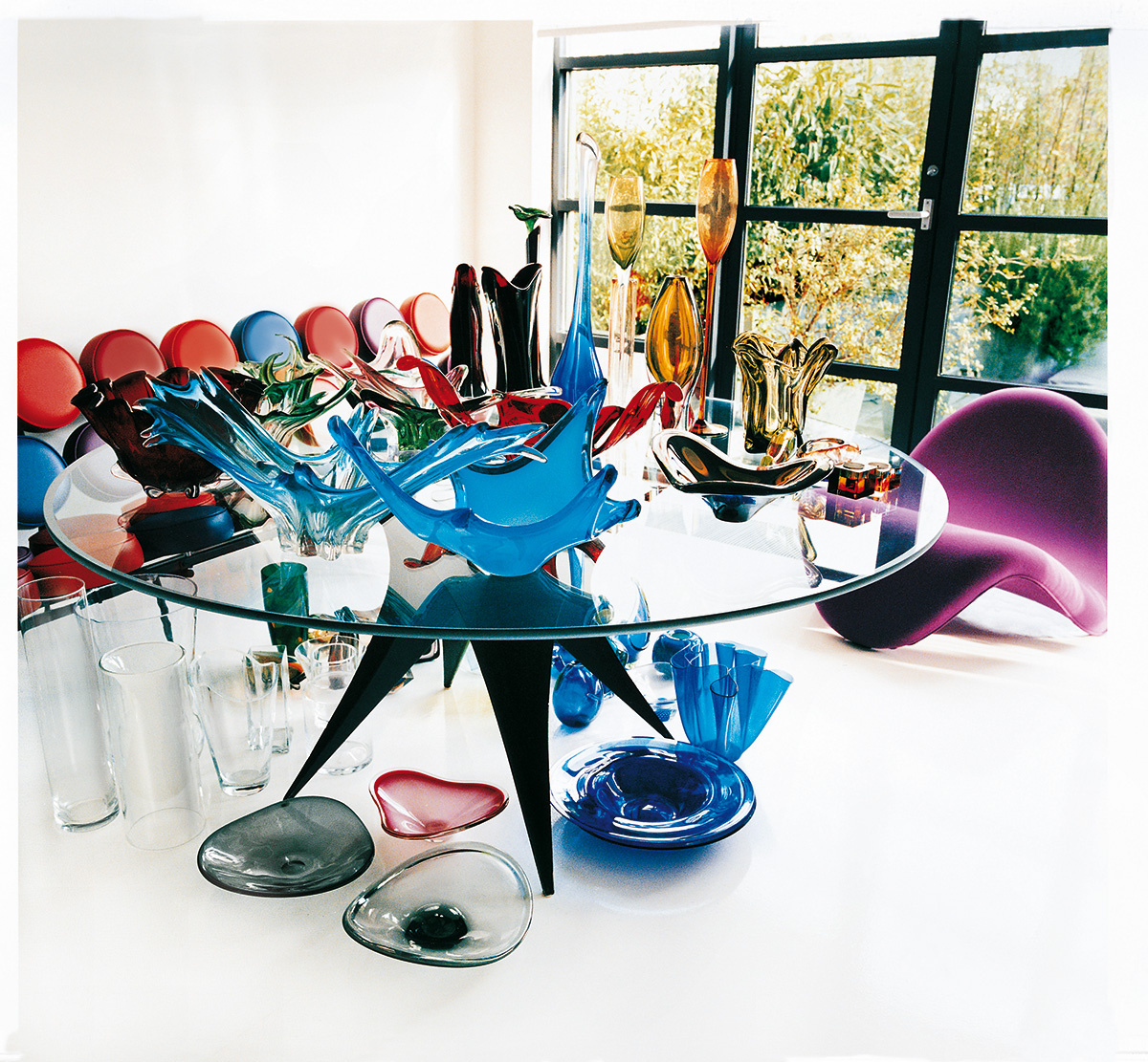
Her collection of Murano glass… plus all that carefully selected furniture. I wonder what would have happened if somebody placed an IKEA wicker chair in her home… ha! Unhappiness, for sure.
jestcafe.com - Zaha Hadid3 
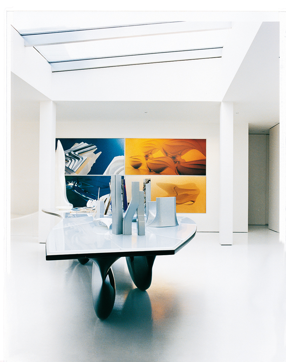
The wall art was created by her. The table is called Aqua, another of her designs. There is a better perspective of it here:jestcafe.com - Zaha Hadid2

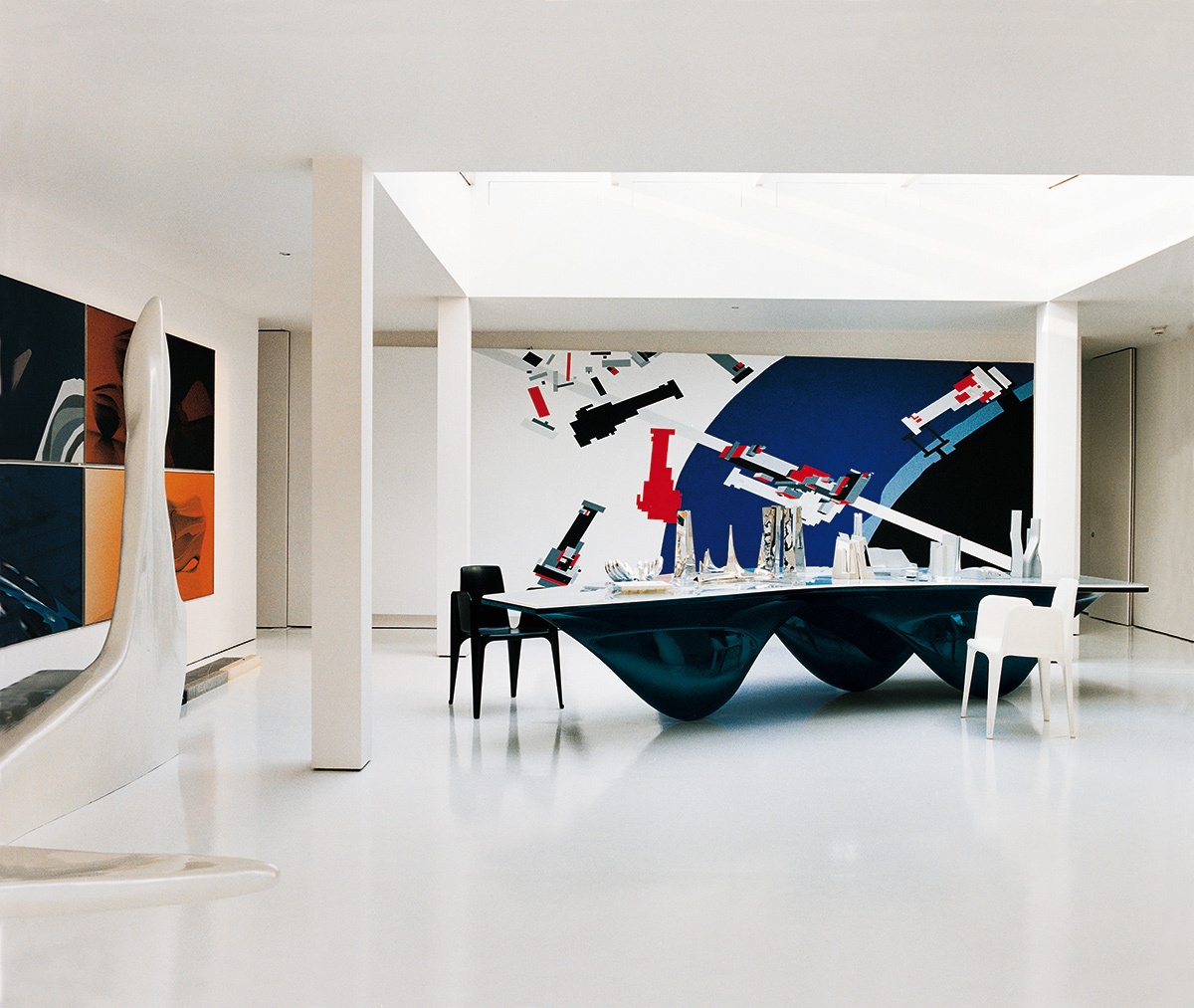
Well, here you go. A lesson on vision and taste from a highly intelligent person. Her home makes me wonder if she was actually human, but I still find it a wonderful source of inspiration.

Hope you liked it.

Let Us Connect:

Let Us Be Inspired by Las Pircas

jestcafe.com-casa-de-toya41

I am getting tired of most “designed” houses looking the same. They are beautiful, it is true: the white walls, the mid-century furniture, the fig tree (which I have in my house, too)… it is all part of the plan, but lately I have been craving something different (I read this same sentiment in this blog the other day).

I am starting to appreciate more and more when somebody adds their own signature to a space. Something that is personal and uncommon. Something unexpected that fosters the soul of a room. Sometimes these places are not what I would do in my own place, but I still admire the boldness and care. I like when people dare to be themselves, instead of what a magazine is telling them to be (though I still like those white rooms, people!)

When I was in Costa Rica, I visited such a place, the house of my friend’s aunt: Las Pircas. It was a sweet house; full of details and decorations that Toya, the owner, has been collecting throughout the years. Every corner had a detail of her own: stained glass (created by her), cement work, vintage findings, etc. I felt I was in a house that was fearlessly curated from her guts (and heart).

We stayed here on our last day in Costa Rica, and I had 45 minutes to take pictures of Las Pircas before heading to the airport. Here is what I saw, if you care to see:jestcafe.com-casa-de-toya40 jestcafe.com-casa-de-toya42jestcafe.com-casa-de-toya38 jestcafe.com-Casa-de-la-Toya35 She loves El Quixote.jestcafe.com-Casa-de-la-Toya34 jestcafe.com-Casa-de-la-Toya33 jestcafe.com-Casa-de-la-Toya32 
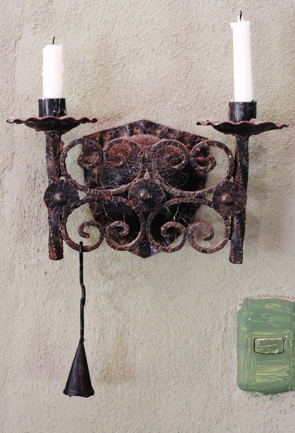
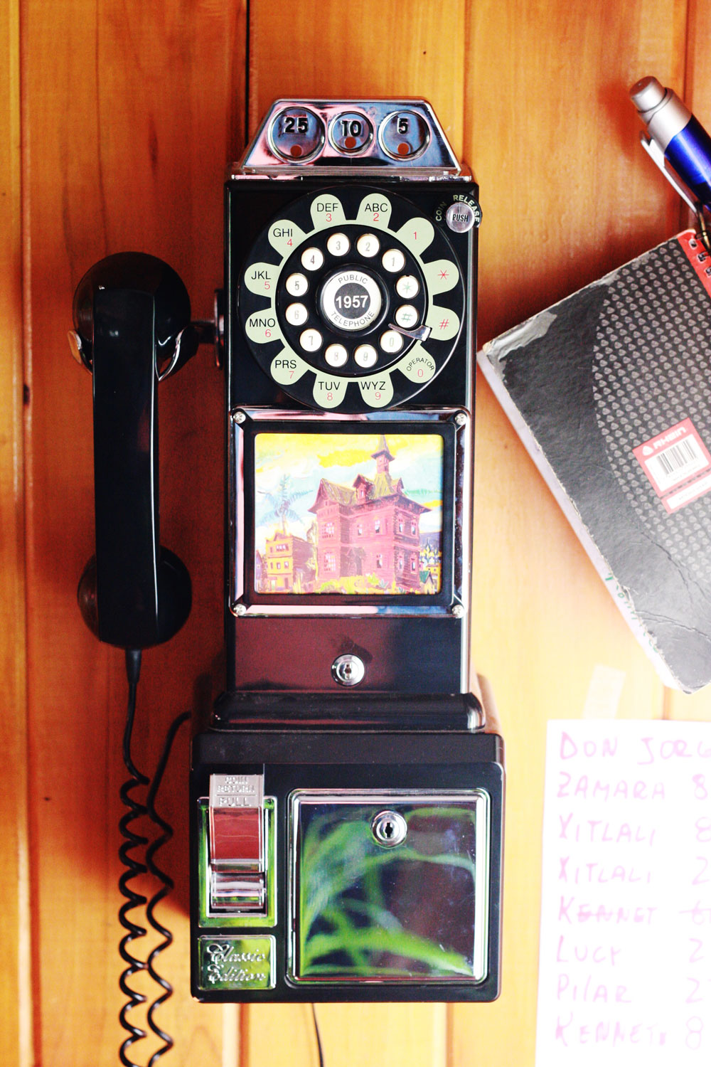
So many cool findings on every wall!jestcafe.com-Casa-de-la-Toya31 jestcafe.com-Casa-de-la-Toya30 jestcafe.com-Casa-de-la-Toya37jestcafe.com-Casa-de-la-Toya26
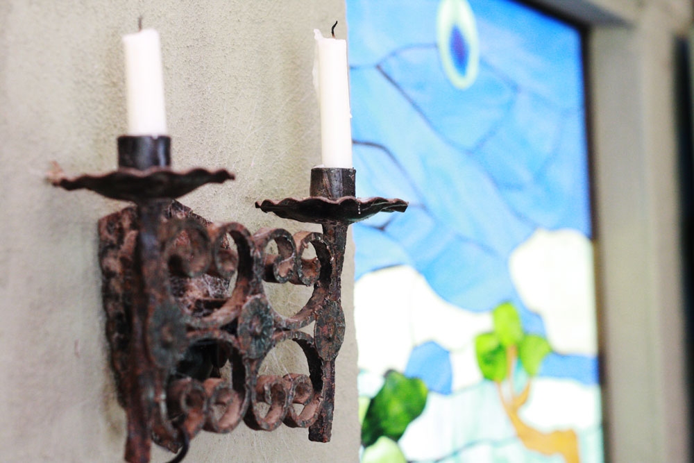
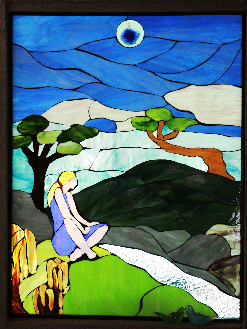
The owner: Toya, created this stained glass. The girl is supposed to represent one of her daughters.jestcafe.com-Casa-de-la-Toya27 
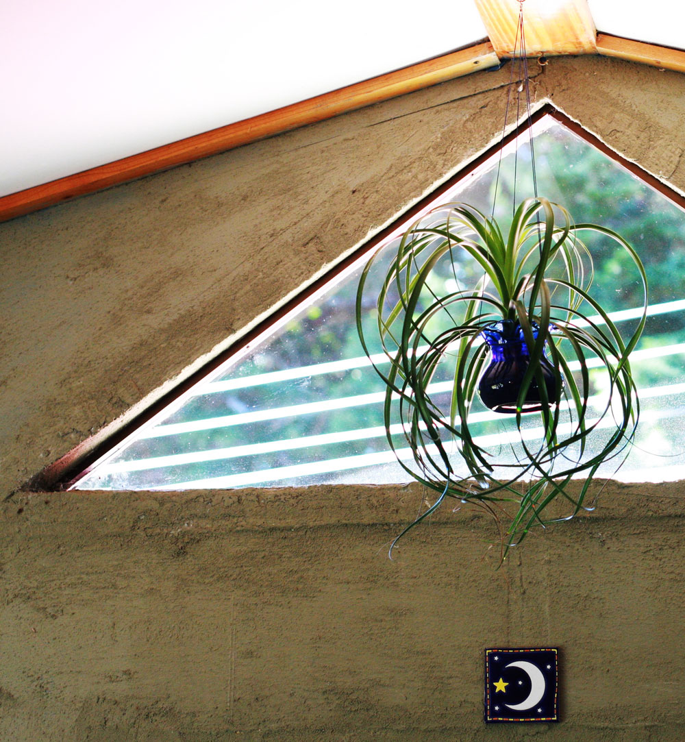
A triangle window… genius!
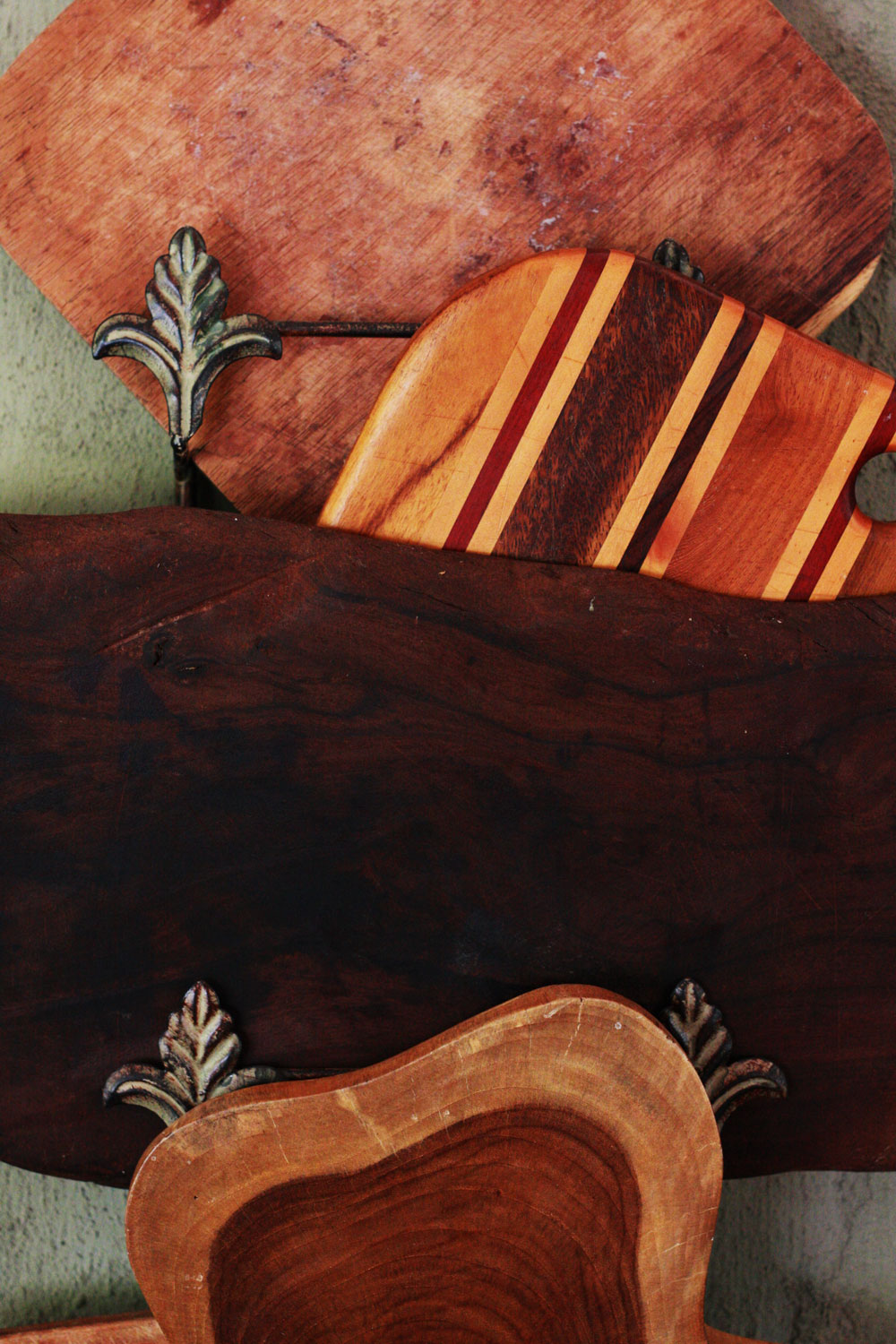
jestcafe.com-Casa-de-la-Toya36 jestcafe.com-Casa-de-la-Toya25 jestcafe.com-Casa-de-la-Toya24 jestcafe.com-Casa-de-la-Toya23 jestcafe.com-Casa-de-la-Toya4 jestcafe.com-Casa-de-la-Toya1jestcafe.com-Casa-de-la-Toya5Teal…jestcafe.com-casa-de-toya39
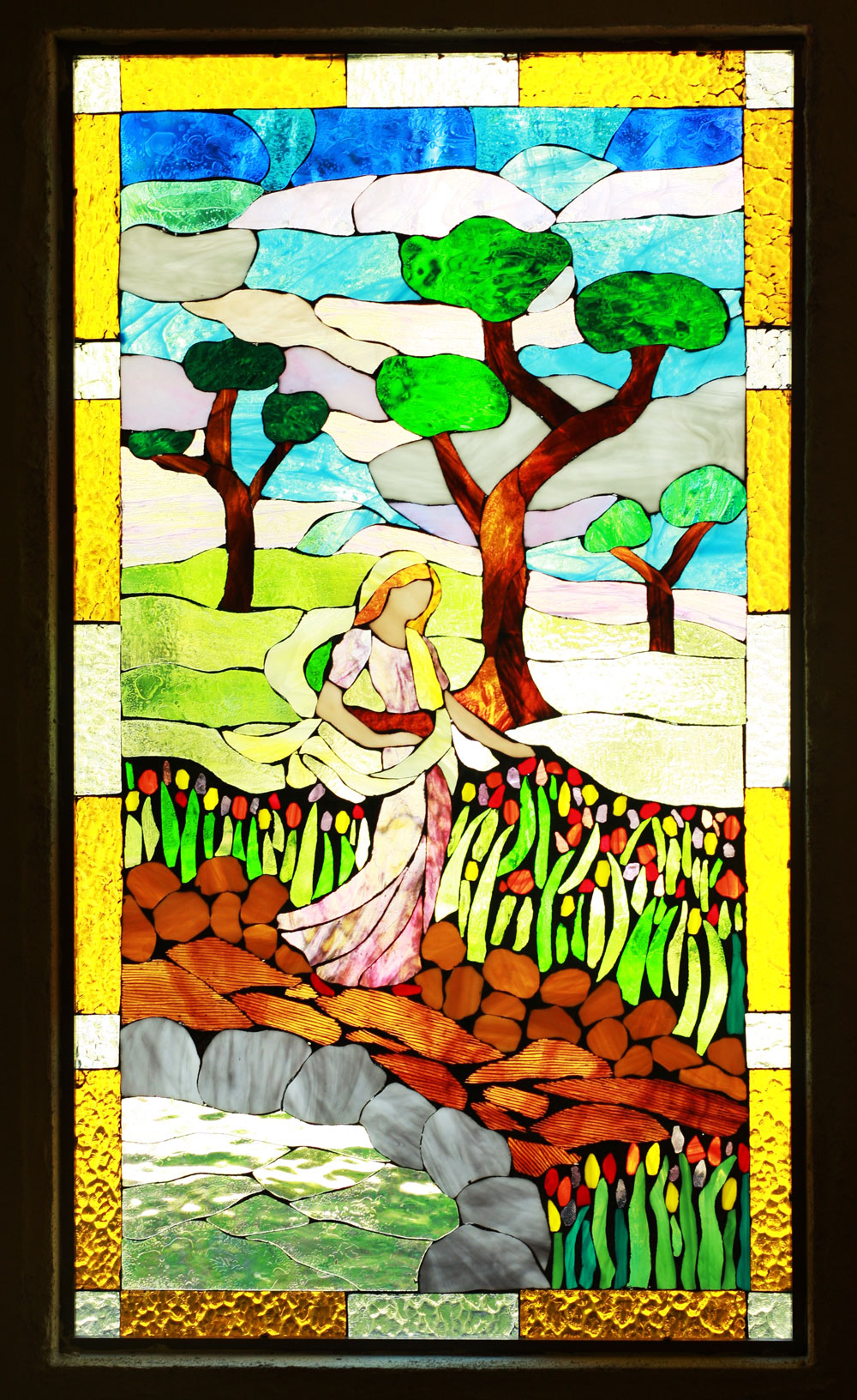
Toya created this stained glass, too. jestcafe.com-casa-de-toya43jestcafe.com-Casa-de-la-Toya22jestcafe.com-Casa-de-la-Toya2
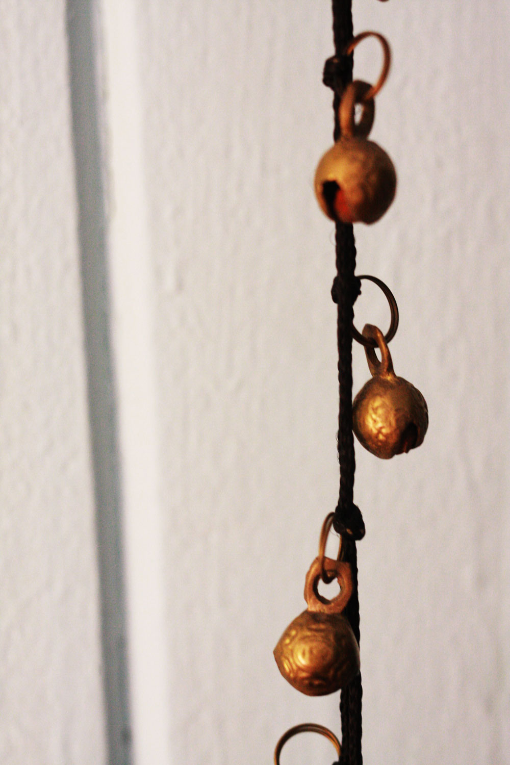
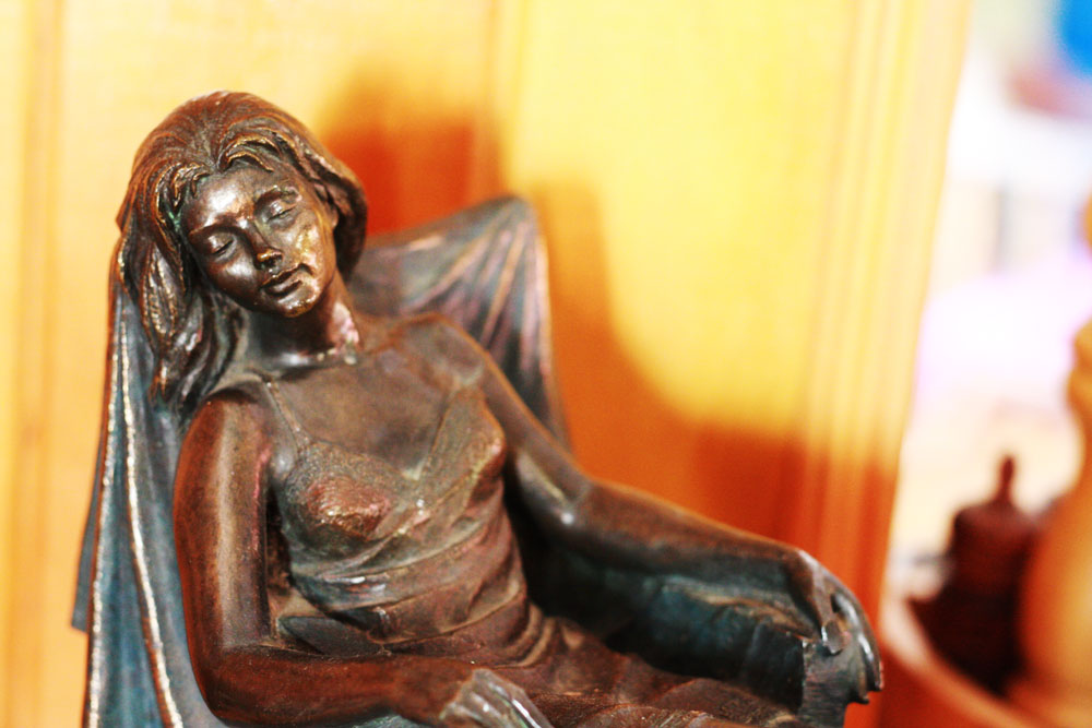
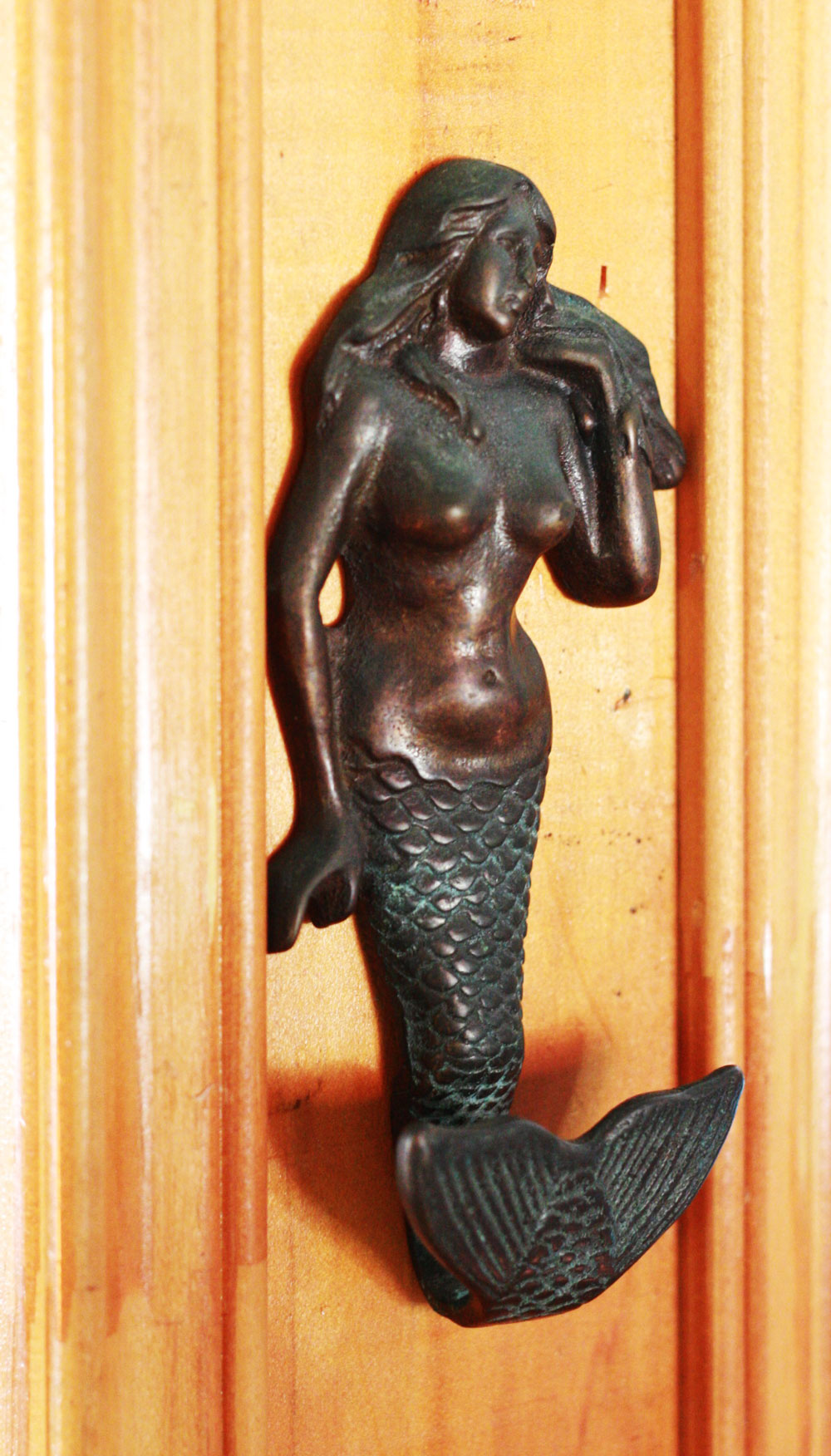
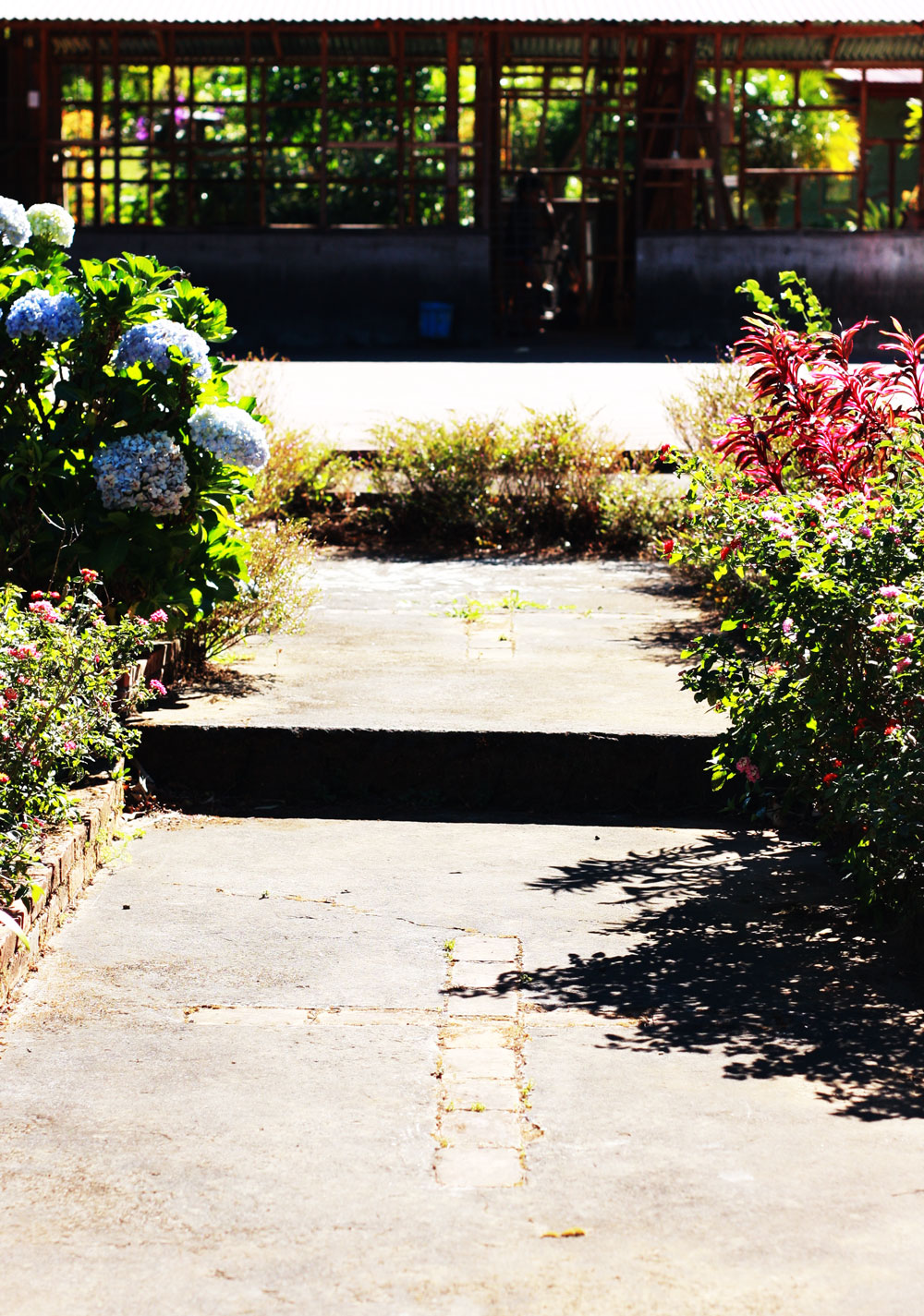
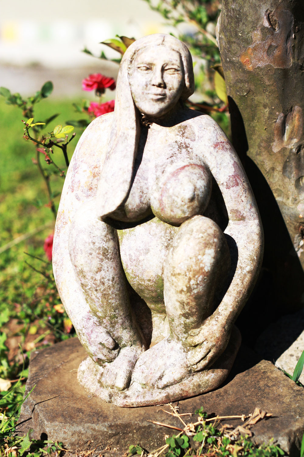
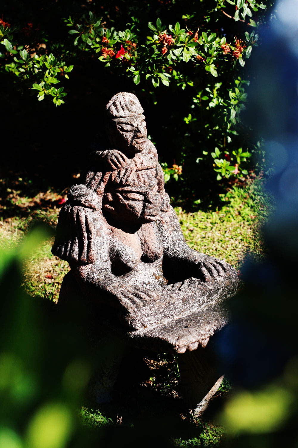
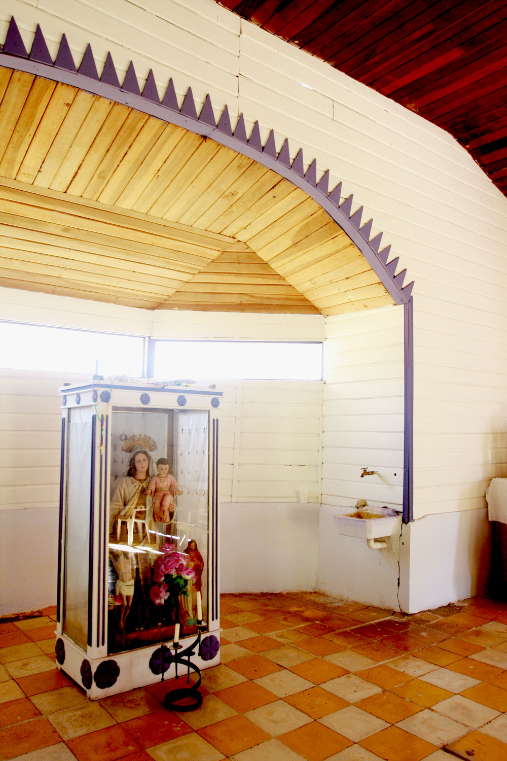
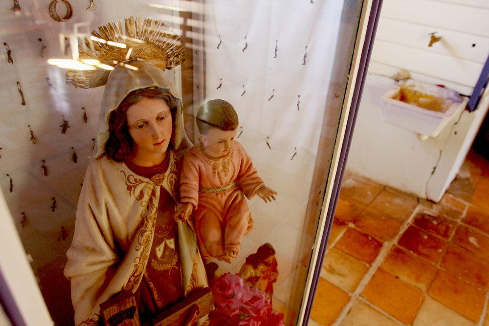
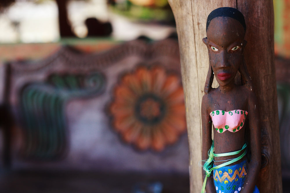
The garden was big and full of statues and random artifacts. It was a magic place: you would never know where the next surprise could be. Also, each statue has a meaning and a reason to be there. jestcafe.com-Casa-de-la-Toya12jestcafe.com-Casa-de-la-Toya8
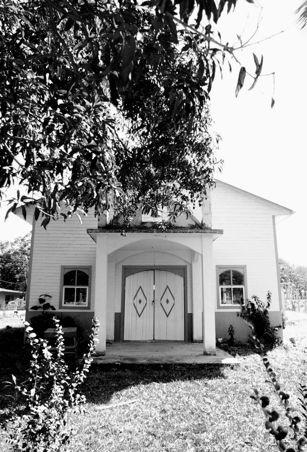
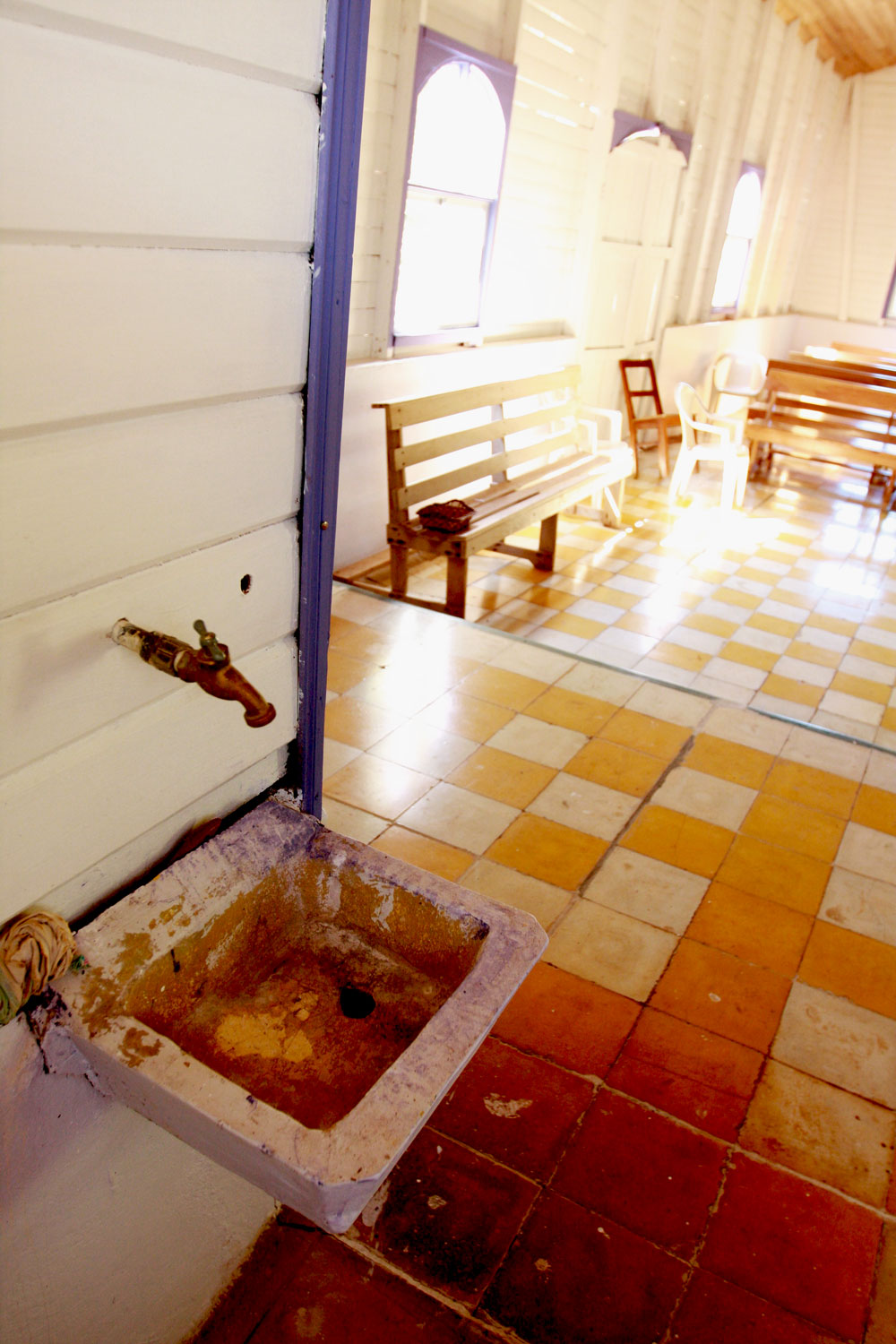
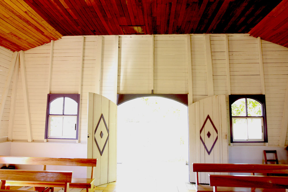
The house was constructed on the grounds of an old church. Can you spot the crosses in the photo above?jestcafe.com-Casa-de-la-Toya3jestcafe.com-Casa-de-la-Toya11 jestcafe.com-Casa-de-la-Toya14
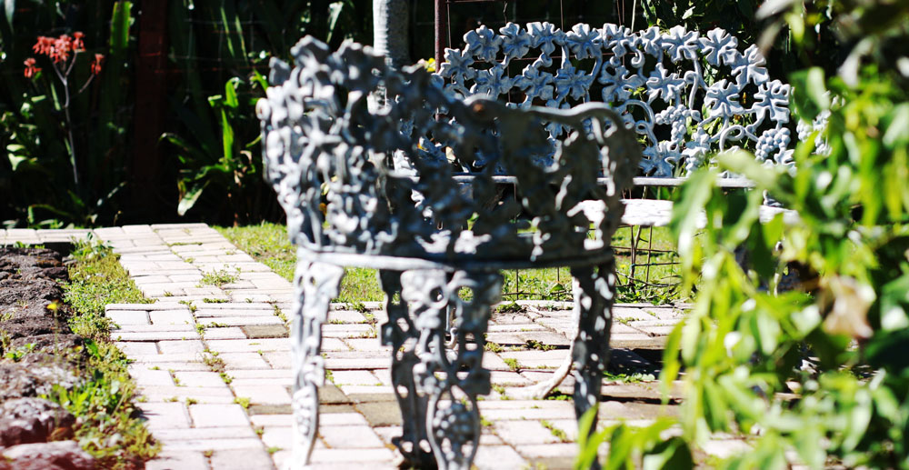
This fairy is so cute. Not more than 5 inches tall, but a lot of personality. jestcafe.com-Casa-de-la-Toya18 jestcafe.com-Casa-de-la-Toya17 jestcafe.com-Casa-de-la-Toya16 jestcafe.com-Casa-de-la-Toya15 jestcafe.com-Casa-de-la-Toya20 jestcafe.com-las pircas 13 
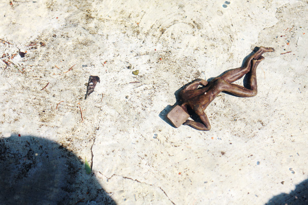
This statue of the man with the square head is my favorite. Toya bought it for her husband after an argument, and it represents the lack of flexibility (and empathy) that men have when seeing the world and women. Did I mention Toya is a feminist? jestcafe.com-las pircas19jestcafe.com-Casa-de-la-Toya10 jestcafe.com-Casa-de-la-Toya9 jestcafe.com-Casa-de-la-Toya7jestcafe.com-Casa-de-la-Toya21

Hope you liked this small tour, and I hope it inspires you to see decoration as an expression of YOUR soul, not the soul of others – this is a lesson I need to apply to my life, too.

Let Us Connect:

What I See A Lot On Pinterest – Vintage Portraits

jestcafe.com-vintage-portraits-1Image Source sfgirlbybay

If you are an interior design aficionado, you know art is an excellent way of bringing life into a room. Photography and prints are a good place to start, but what I really like are paintings, especially vintage portraits.

Affordable portraits are not easy to find, so I always find myself foraging for them in thrift stores, estate sales or flea market. This habit can be scary sometimes because most of the art you find in these places is hideous, horrible, ugly, gross (no exaggerating) … until you find that gem.

Thrift stores have a LOT of paintings from wanna be artists that are unattractive. Sometimes, these stores want to charge a lot of money for a piece of trash! Don’t let them trick you, and try to bargain them down. I usually find a nice piece for less than $100. $50 is a great thrift store deal, but it all depends on the painting. As my uncle (a vintage expert) says ” if you like it and you are willing to pay the price, is a good deal.” No regrets!!

The ideal thrift situation is to have a relationship with the manager of such store. To do this, you need to be in that thrift store often and always be NICE. If they won’t come down in price, come back another day. The painting you want is probably still going to be in there. Art doesn’t sell that fast. On the other hand, if you are totally in love with the painting get it right away. Spending the rest of your life regretting that time when THE ONE got away is a stressful way of living. I have been there and done that, and it is not easy on the heart! Believe me. I still find myself daydreaming about that ugly man in that one painting that somebody stole away from me a couple of years ago.

Back to vintage hunting, the more you do it, the better you get at it. Practice is the only way to develop a critical eye that is able to find beauty in what others would consider average. Pay attention to some of the portraits below and imagine finding them in a thrift store. Some of them are outright ugly, but, once they are hanging on a wall, they work!

Here are some examples of vintage portraits that transform average spaces into interesting ones:

jestcafe.com-vintage-portraits3 Image Source Design Spongejestcafe.com-vintage-portraits4 Image Source Méchant Studiojestcafe.com-vintage-portraits5 Image Source sfgirlbybayjestcafe.com-vintage-portraits6 Image Source My Scandinavian Homejestcafe.com-vintage-portraits8 Image Source Designfilesjestcafe.com-vintage-portraits11 Image Source Jim Fairfaxjestcafe.com-vintage-portraits12 Image Source That Kind Of Womanjestcafe.com-vintage-portraits13 Image Source Ebayjestcafe.com-vintage-portraits14 Image Source Carla Astonjestcafe.com-vintage-portraits16 Image Source Apartment Therapyjestcafe.com-vintage-portraits19 Image Source Remodelistajestcafe.com-vintage-portraits21 Image Source Remodelistajestcafe.com-vintage-portraits23 Image Source Design Filesjestcafe.com-vintage-portraits24 Image Source Verdigris Viejestcafe.com-vintage-portraits25Image Source One Kings Lanejestcafe.com-vintage-portraits10Image Source sfgirlbybay

LOVE!

Let Us Connect:

Design Inspiration From A Church In Costa Rica

jestcafe.com---Costa-Rican-church-10

We just came back from an amazing vacation in Costa Rica. I will write more about it next week, but today I want to share some pictures of a small treasure we found along the way.

One day we were driving from Carrillo beach to Punta Islitas beach in the Pacific Ocean when we got lost. We took a wrong turn and, luckily, stumbled into a gorgeous church in the middle of nowhere.

The purple and white exterior spoke to me right away, so we stopped to take some photos,. Little did I know that the real surprise was going to be inside. It was a small, rural, humble building with yellow, white and teal floors, and white walls with purple accents. It also had the most gorgeous wooden ceiling you have ever seen.

The building was full of light, which I loved, and it had almost no decorations… it was so simple and beautiful. One of those unknown gems that you find while staying outside of the tourist path. Here are some pictures:

jestcafe.com---Costa-Rican-church-11jestcafe.com---Costa-Rican-church-21 jestcafe.com---Costa-Rican-church-20 jestcafe.com---Costa-Rican-church-19 
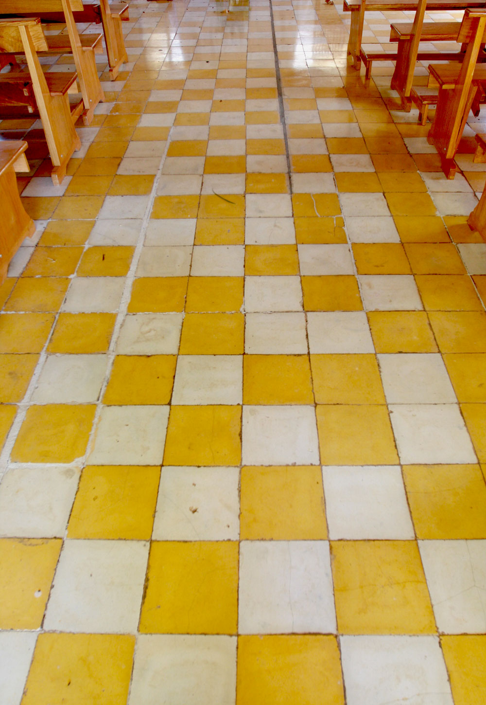
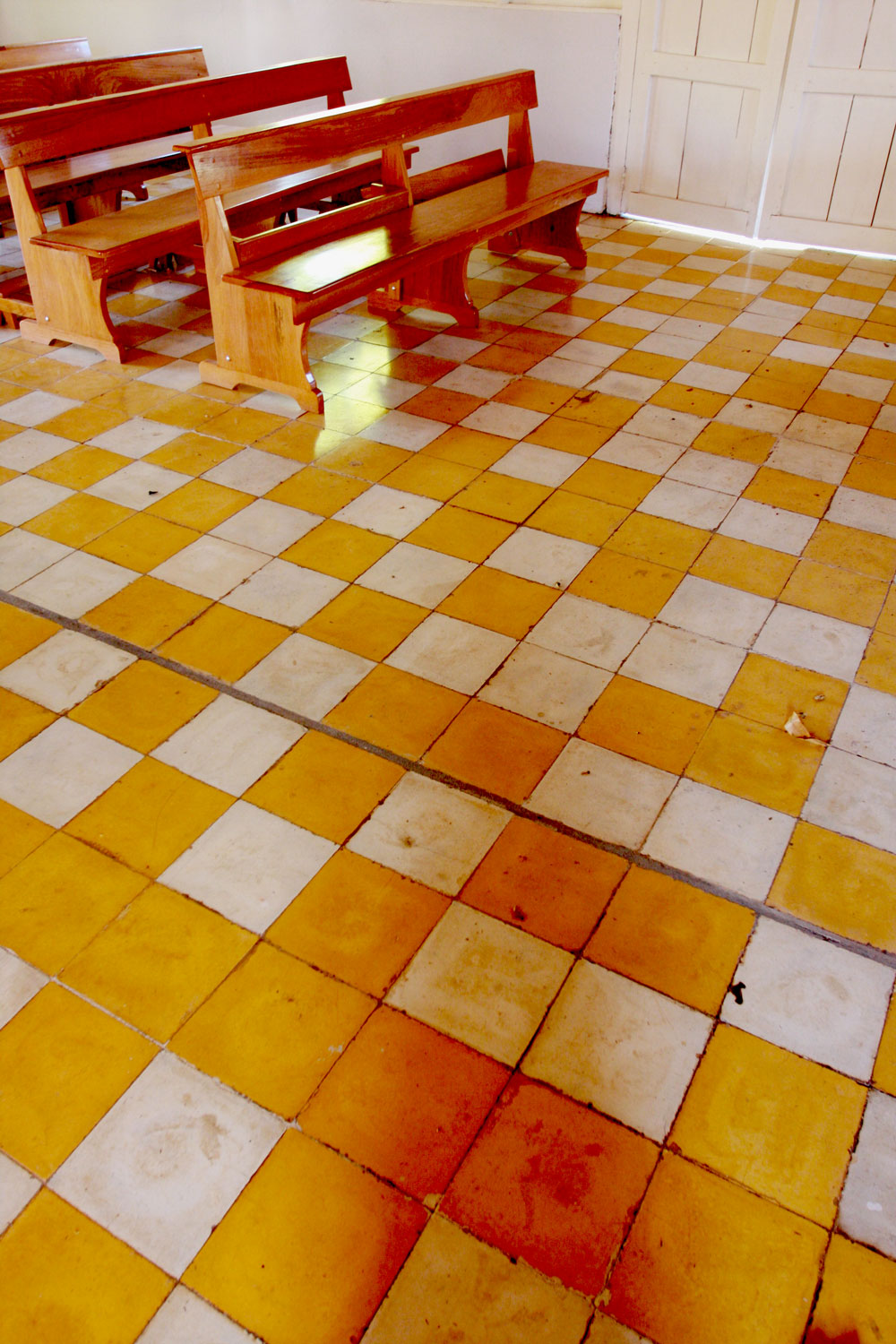
Look at the messy floor pattern and amazing colors:jestcafe.com---Costa-Rican-church-18
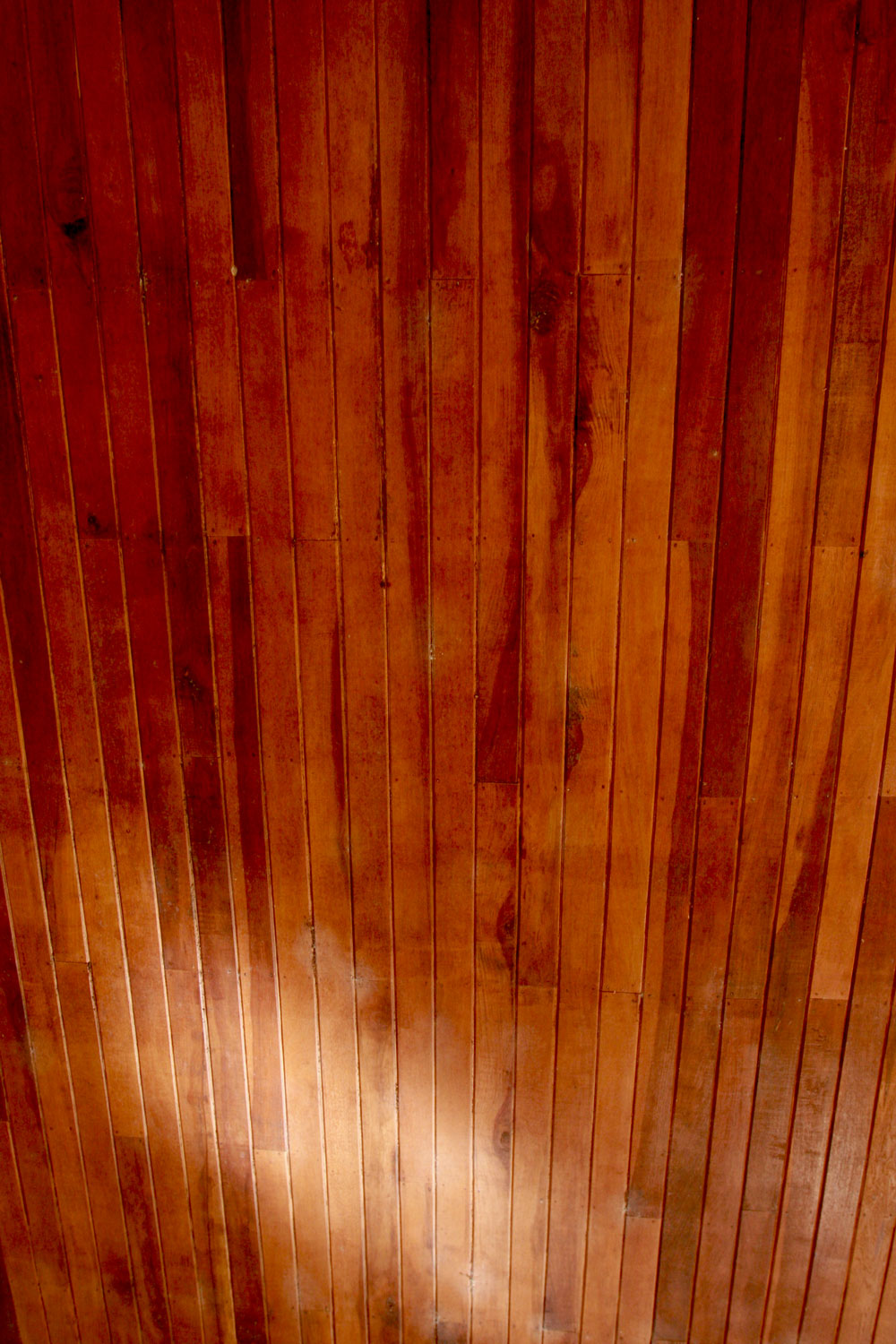
What about this gorgeous wooden ceiling I mentioned earlier. I want it in my house, don’t you?
jestcafe.com---Costa-Rican-church-15 jestcafe.com--church-costa-rica-12jestcafe.com---Costa-Rican-church-13
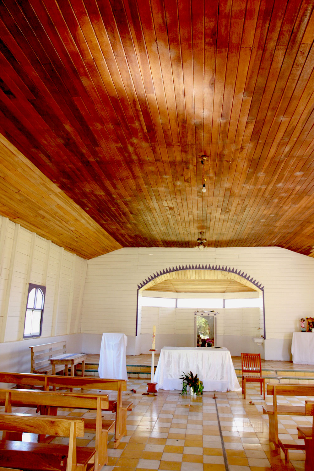
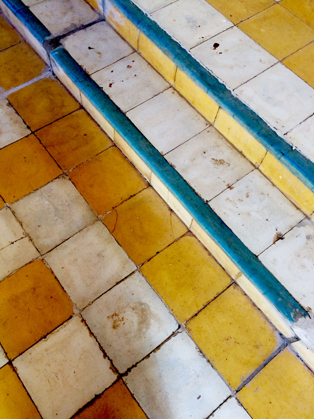
And as the final cherry on top, those teal tiles:jestcafe.com---Costa-Rican-church-16jestcafe.com---Costa-Rican-church-2 jestcafe.com---Costa-Rican-church-1 jestcafe.com---Costa-Rican-church-9 jestcafe.com---Costa-Rican-church-8 jestcafe.com---Costa-Rican-church-6 jestcafe.com---Costa-Rican-church-5jestcafe.com---Costa-Rican-church-7 jestcafe.com---Costa-Rican-church-4 jestcafe.com---Costa-Rican-church-3 jestcafe.com---Costa-Rican-church-14

I loved this church so much, that I went back to take more pictures another day. Simplicity is beautiful, and I was reminded of that on this vacation.

Have a wonderful day!

Let Us Connect:

Cool Wallpaper For The Nursery

I am back from Costa Rica. It was a wonderful and relaxing trip. I will write more about it on another post, but, in the mid time, let’s talk about Interior Design.

I am planning to design my kids’ room this year. I want to do it for the #oneroomchallenge on Instagram, so I am starting to gather ideas and make decisions about what I want it to look like.

Here is one of the pictures I have chosen for inspiration:

jestcafe.com--wallpaper-kids-inspiration
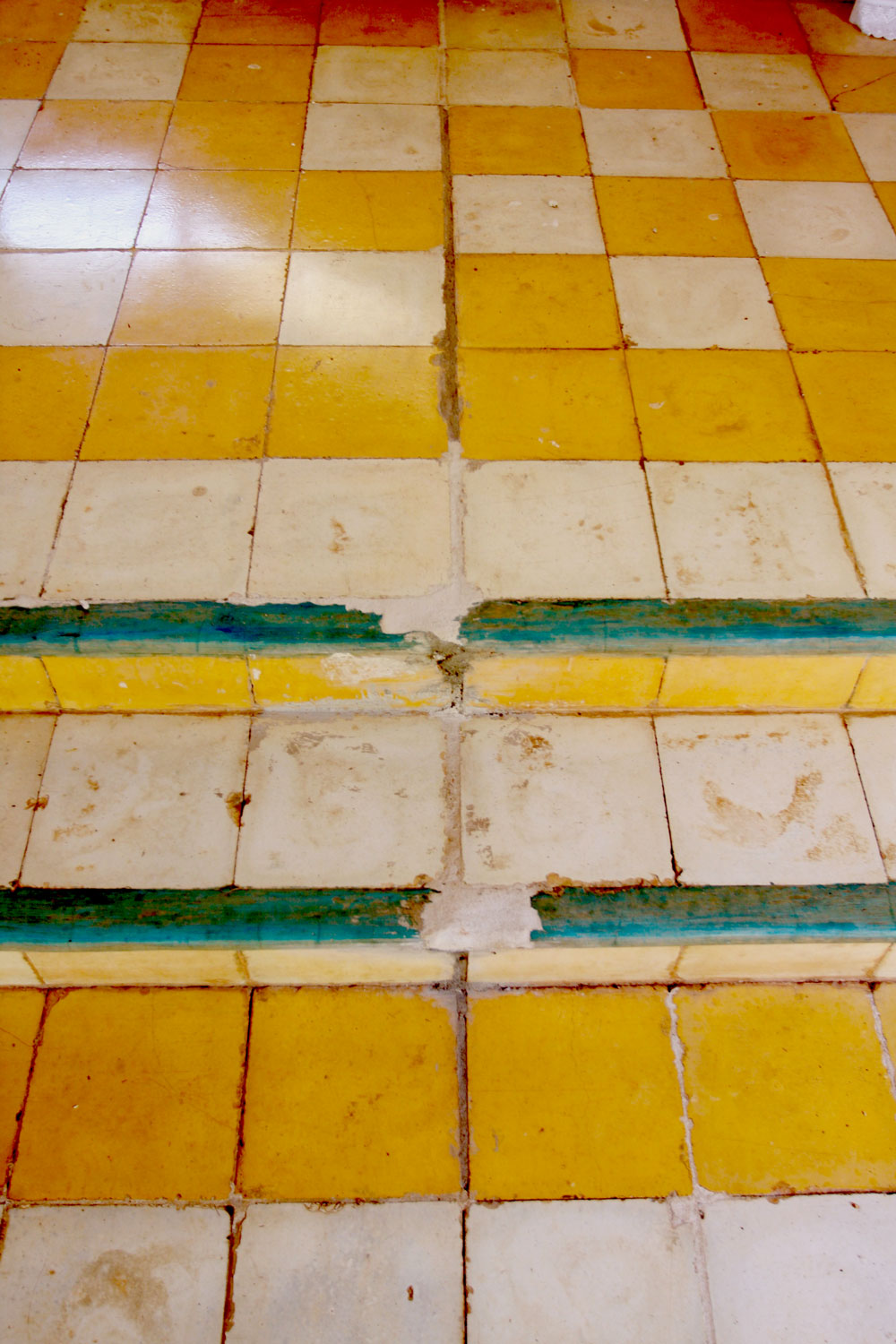
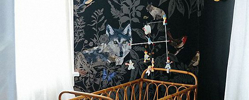
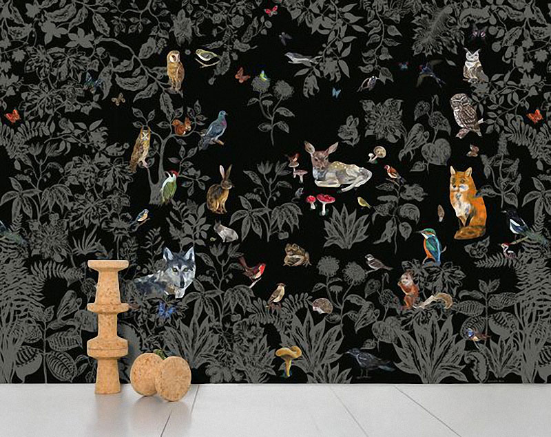
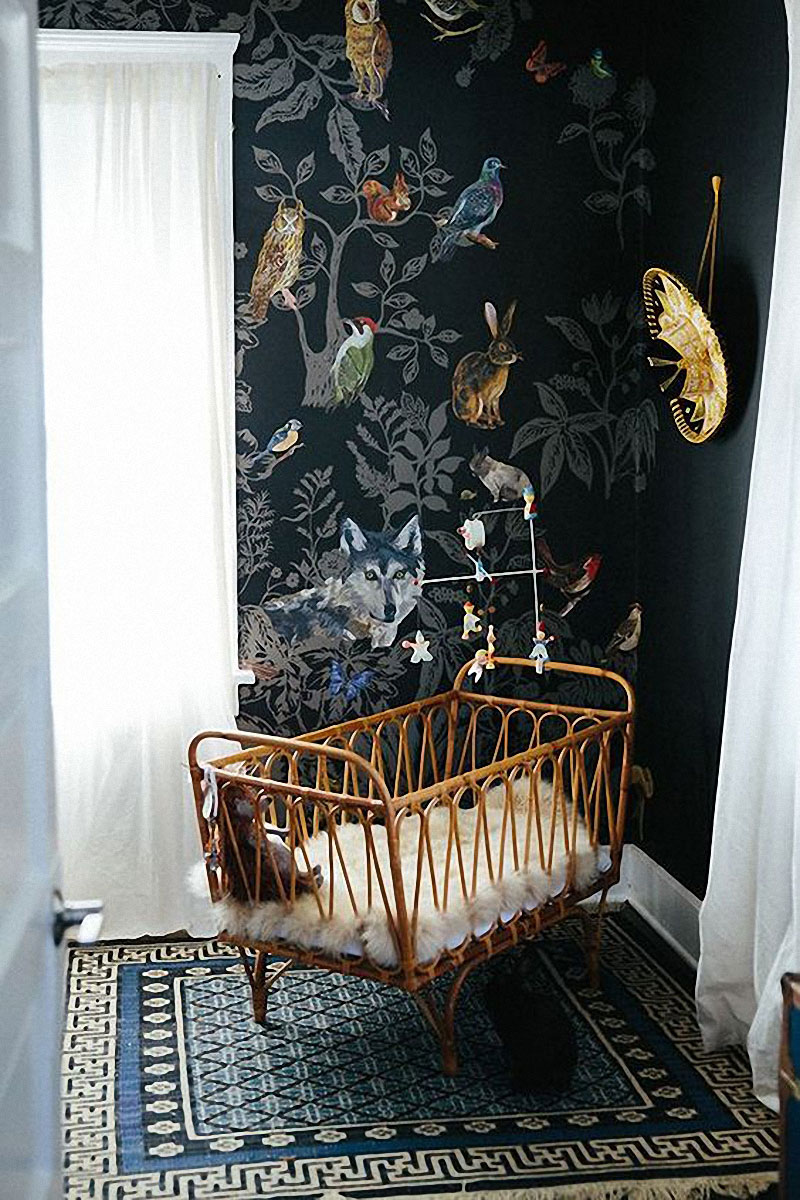
So whimsical, isn’t? The perfect mix of modern and vintage and it is all in that wallpaper. It is dark, edgy, and magical. It is a beautiful statement for a child’s room, don’t you think? It is also risky because you need to be careful about how to decorate around it. I can think about a lot of pieces of furniture that won’t go with it, but, isn’t a wonderful touch for the room? The wallpaper is called Forest Noire from Nathalie Lété, and they sell it at Domestic in France. Here is a picture of the whole roll. jestcafe.com--wallpaper-for-nursery-2

From this company and designer, I also love the wallpaper called Sour la mer. Here it is:

jestcafe.com- wallpaper for nursery 1

Very colorful and moody. The only issue is that it is a mural and I don’t see how I can seamlessly attach one roll next to the other. Do you see how the design in  both ends (right and left) don’t match?

In any case, the world of wallpaper is full of amazing designs and it is difficult to choose just one. Here are some other options that I am considering. Do you like any of them and, if yes, which one is your favorite?
jestcafe.com--wallpapers-for-nursery

 1. Underwater World – Hygge & West | 2. Mushroom Forest – Anthropologie | 3. Acquario – Cole & Sons

     4. Varklockor – Josef Frank | 5. Party Animals – Anthropologie | 6. Serengeti – Hygge & West

7. Alice in Wonderland – Voysey | 8. Mr. Blow – Abnormal Anonymous | 9. Cosmic Dessert – Justina Blakeney

10. Eclipse – Aimée Wilder | 11. Aquatic – Potok | 12. Angelic Forest – Voysey

Let Us Connect: